Welcome to a new Easy Exposure Photo Forum! I hope you will enjoy new features. It is still work in progress, so please be patients. Thanks!
 Topic RSS


 (0 votes)
 5:49 pm
August 11, 2011
 Offline
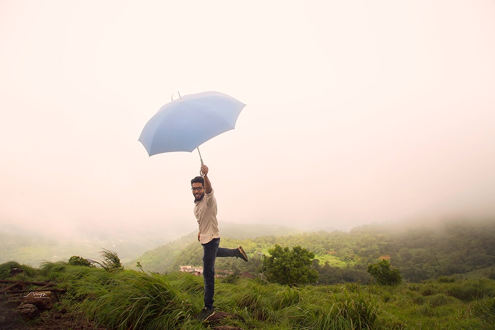
I think it is a great concept and I love the color tons of the image, but I slightly bothered with composition. I feel like her is too close the the edge with his foot and too much empty space above. I would frame him buy lowering my camera a bit. You could also play with the image in post by cropping the top and extending the bottom a bit.
7:30 am
VIP Student
September 15, 2012
 Offline
9:31 am
September 30, 2012
 Offline
easyexposure said
I think it is a great concept and I love the color tons of the image, but I slightly bothered with composition. I feel like her is too close the the edge with his foot and too much empty space above. I would frame him buy lowering my camera a bit. You could also play with the image in post by cropping the top and extending the bottom a bit.
yes, agreed in composition part, i too felt that there is little dead space on right side.
Muneer
Most Users Ever Online: 1107
Currently Online:
17 Guest(s)
Currently Browsing this Page:
1 Guest(s)
Top Posters:
Mandrake: 2719
nikonguy: 1594
mscharff: 1054
Muneer: 812
Silky: 554
intekhab0731: 553
sameerfulari: 466
Brian Copeland: 449
ergig: 307
Bjørn (Madman): 278
Member Stats:
Guest Posters: 9
Members: 2557
Moderators: 0
Admins: 1
Forum Stats:
Groups: 14
Forums: 87
Topics: 2764
Posts: 15326
Newest Members:
Rollinsparry, maryamsmarthasAdministrators: easyexposure: 2164
 Log In
 Members
 Home
Home


