Welcome to a new Easy Exposure Photo Forum! I hope you will enjoy new features. It is still work in progress, so please be patients. Thanks!

 Log In
 Members
 Home
Home

 Topic RSS

 (0 votes)


Any comment.. for enhancement..
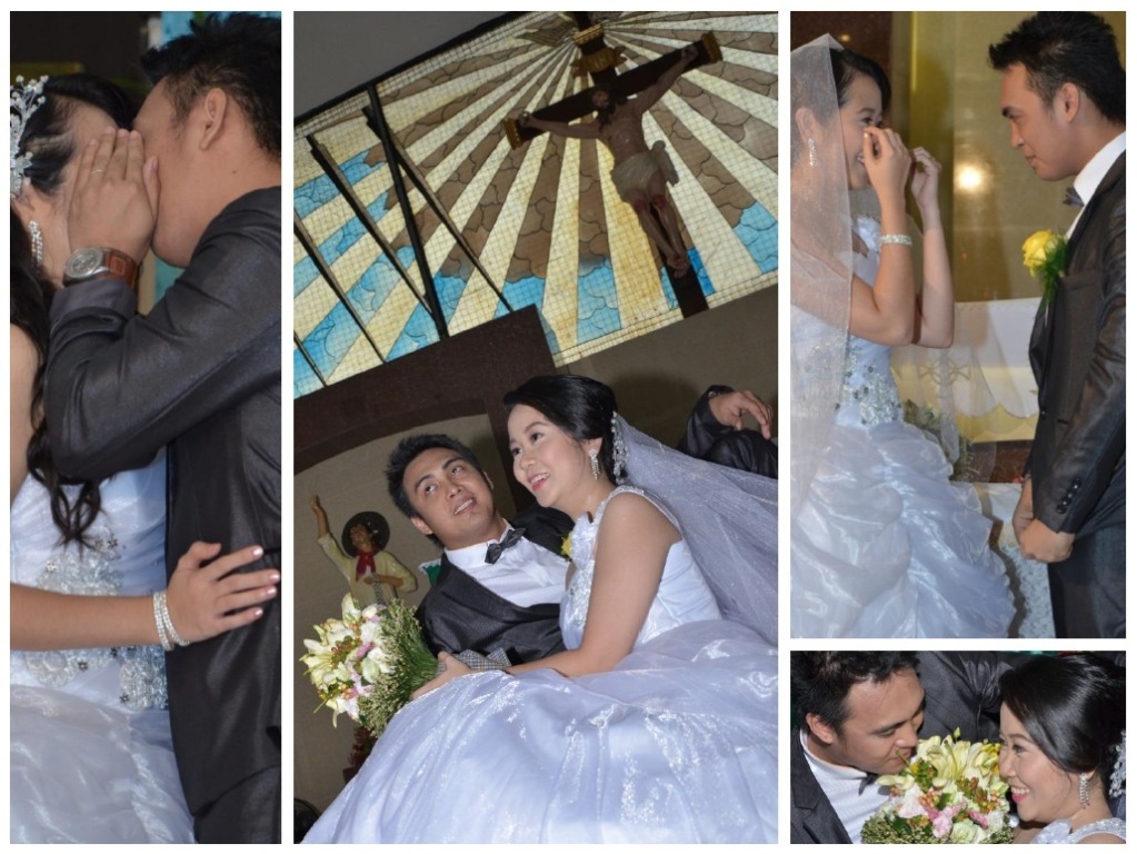
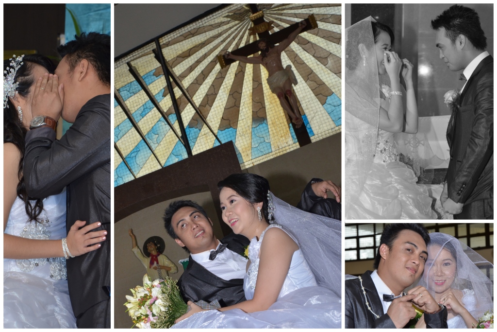
Basically this is the pattern I like to create.. I am currently at my office and using office PC (no photoshop).
Later I’ll post edit… this picture
Thank you.
Best regards,
3:23 pm

VIP Student
September 15, 2012
 Offline
Chasmz… This is a really nice presentation.
The set is completely unposed and quite personal which is perfect for the occasion.
From your comments I was not really sure if you were the photographer
or had chosen these as an example of what you would like to do.
Mandrake.
-- Mandrake --
I took the photos…
I edited it in photoshop (planning to print it 12″x18″). resolution hxv is 800dpi.. 47mb each picture… hahaha
please comment (reduce resolution for posting purposes)..
Thank you.
Best regards,
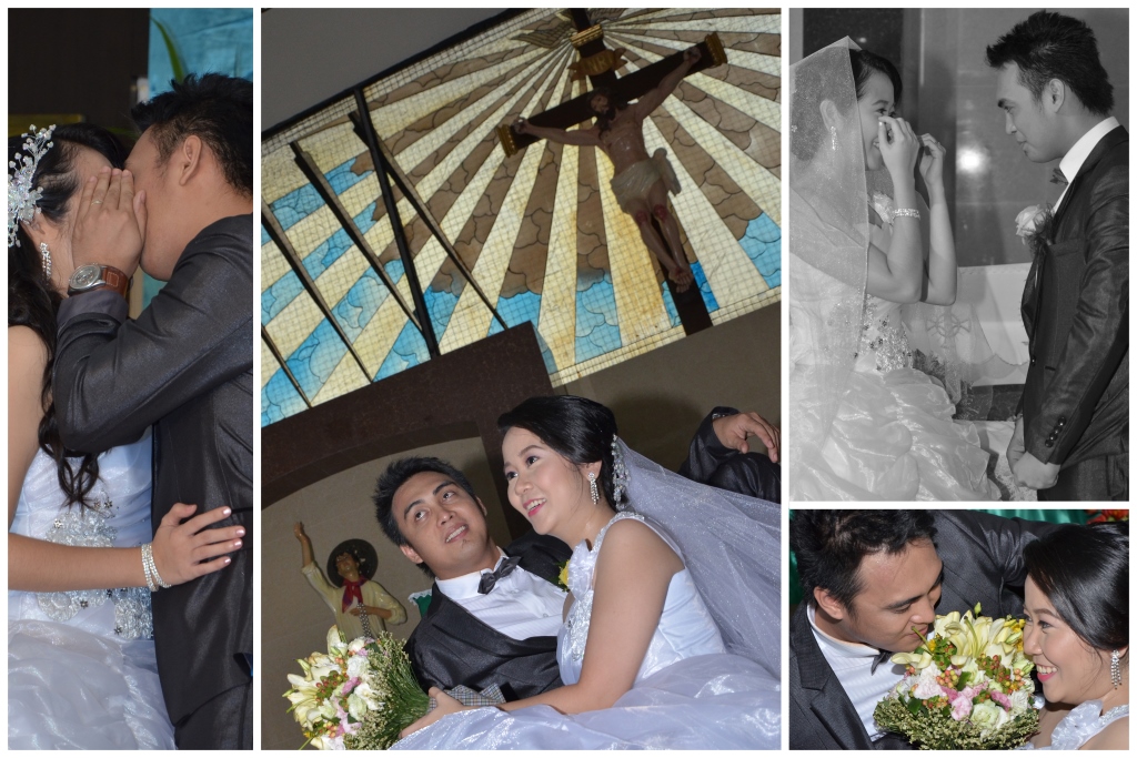
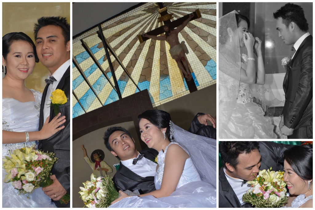
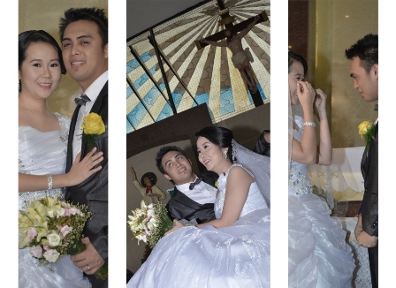
The 2nd set is best, the bride doesn’t have her face covered in the 1st image and the face by the flowers in the last image is playful without being for lack of a better word, cheesy, like the pointing at the rings; that’s, at least for my tastes too literal.
2 main things that stick out to me are both with the black and white image. In an album spread we want consistency across the board, so all photos in black and white or all photos in color, this applies to content as well, we don’t want a spread with a serious shot, a crying shot and a laughing shot. We want to carry the emotion through the spread, not saying that was an issue just an FYI while on the topic.
The other thing is with the black and white image the grooms expression and especially his hands are not matching the story the bride is telling in the image. He is very stiff, nervous or whatnot. People love natural shots but here’s the thing to remember, it’s a still photo so you can direct and as long as you can extract that emotion for a fraction of a second that’s what counts. Excluding the ceremony and dances I am not afraid to tell anyone what I want, my job is to make them look their best and open the album decades later on a bad day and remember how fantastic their day was.
This image for example I directed it completely, I did unfortunately overlook the hand of the 2nd bridesmaid that is in a fist but I positioned them, told them where to look, at the groom and the last bridesmaid to look off, and said something ridiculous to get a natural reaction. The girl who did the fist had a problem area under her chin where if her face was down she would get a double chin so I had her bend forward slightly and look up to stretch that out. I only say this because my first few weddings I was more comfortable hiding behind my camera getting natural moments, once I stepped out of my comfort zone and took control I noticed a much needed improvement in my work.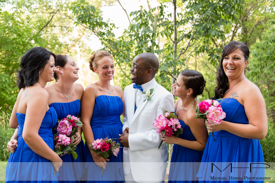
It will be uncomfortable at first being so hands on but as you learn how to position people to make them look fantastic and work to pull out the emotions you will be surprised at the difference. I like your main image and the interesting perspective, way to keep an eye out in moving around and finding interesting ways to shoot a scene.
4:31 am
VIP Student
September 15, 2012
Offline
I totally agree with Mike that the inclusion of one black and white photo in the group is not a great idea.
As I understand it, you are asking us which grouping of the four individual photos is the best.
I like the first set the most. It begins with the groom holding his hand to hide their kiss.
This perfectly sets the playful mood depicted in the other photos in the group.
Mandrake.
-- Mandrake --
4:48 am
VIP Student
March 23, 2013
Offline
Some great advice… thanks Mike.
Thank you very much on the comments and suggestion. I really appricate it and looking forward for more advises..
Actually this is my friends wedding and they hired professional photographers..
I am still a newbie and had not experience wedding photography… I love to try your suggestion (In time)..
Again really appriciate your comments and suggestion…
Thank you.
Best regards,
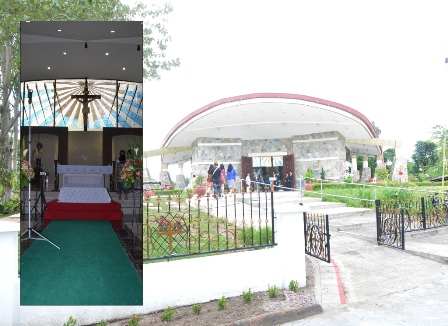
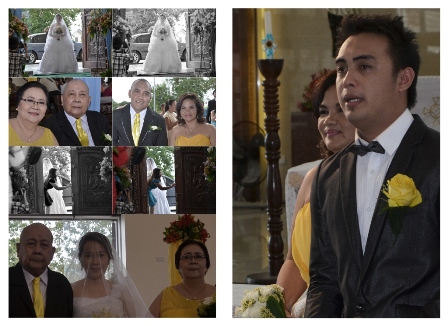
Before I am planning to give one (1) edited photo in a frame however I change my mind… I’ll give them a photo book.
Here are some sample pictures (edited it before I read the suggestion and comment of Mr. Mike)…
Thank you.
Best regards,
3:27 am
VIP Student
September 15, 2012
Offline

The cover looks like it is for a funeral, not a wedding.
First page: The 1st photo is not attractive and shows the light stand. The 2nd photo is overexposed.
Second page: The 1st photo has too many and too similar images. The 2nd photo is good (groom is the boss) lol.
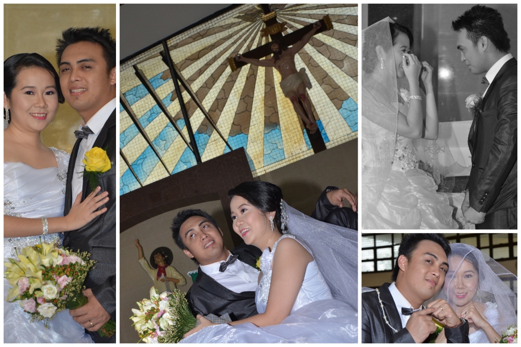
Third page: This is good (Marriages often end in a big fight after happier beginnings).
Mandrake.
-- Mandrake --
4:59 am
VIP Student
March 23, 2013
Offline
Concur with Mandrake.
4:26 am

April 25, 2019
Offline
Oh, you did a lot of job here. As an experiment – that’s great, but as for work a personally use some web retouching services not to deal with routine
Most Users Ever Online: 1107
Currently Online:
11 Guest(s)
Currently Browsing this Page:
1 Guest(s)
Top Posters:
Mandrake: 2719
nikonguy: 1594
mscharff: 1054
Muneer: 812
Silky: 554
intekhab0731: 553
sameerfulari: 466
Brian Copeland: 449
ergig: 307
Bjørn (Madman): 278
Member Stats:
Guest Posters: 9
Members: 2557
Moderators: 0
Admins: 1
Forum Stats:
Groups: 14
Forums: 87
Topics: 2764
Posts: 15326
Newest Members:
Rollinsparry, maryamsmarthasAdministrators: easyexposure: 2164
