Welcome to a new Easy Exposure Photo Forum! I hope you will enjoy new features. It is still work in progress, so please be patients. Thanks!
 Topic RSS


 (0 votes)
 1:23 am
August 10, 2012
 Offline
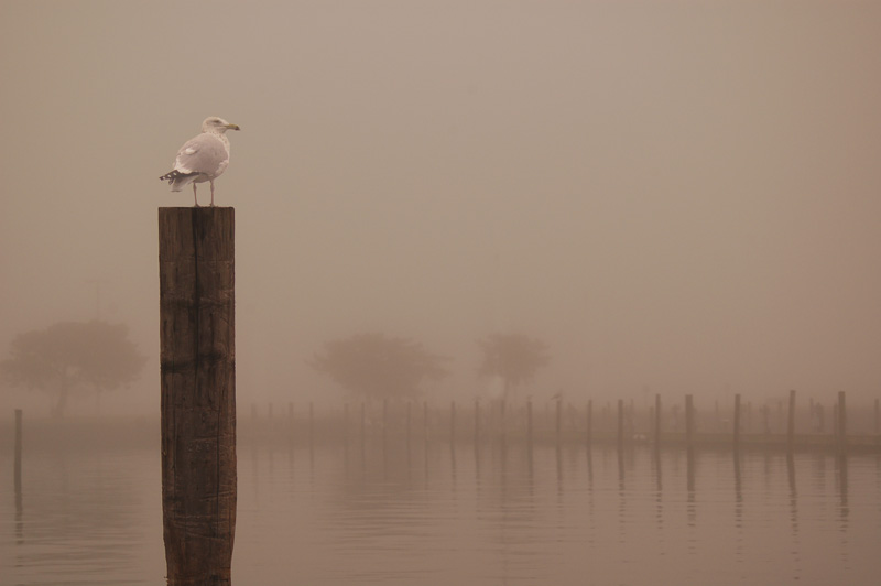
I like the first foto best, but i the seagull should be a bit clearer.. Nice shot.
7:34 am
VIP Student
December 2, 2012
 Offline
7:38 am
VIP Student
January 19, 2013
 Offline
12:36 am
January 18, 2013
 Offline
Hi all,
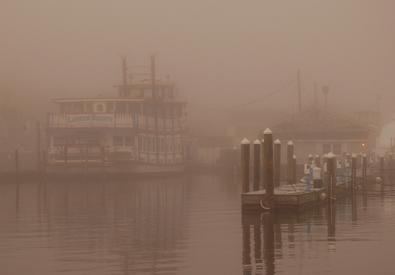
These were shot with Nikon D50, 80mm, ISO 200, f7@1/800 sec with -1/3 Exposure compensation (to prevent the fog from blowing out). The color tone was achieved by using the shade white balance setting to warm the image showing detail in the fog better. Then I went to breakfast. Thanks all for your input! Nice group of people here!
2:43 pm
VIP Student
September 15, 2012
 Offline
5:07 pm
VIP Student
December 2, 2012
 Offline
11:06 pm
August 10, 2012
 Offline
Mandrake said
Interesting shots…
I especially like the harbor scene with the paddle wheel.
I would remove the blue on the pier so that the only color was on the boat.Kill the gull in pic 1 and the tree on the left in pic 3.
Mandrake.
I do not agree with what you are saying here. Without the seagull pic. 1 looks weird and it is the gull that makes the pic.
In pic. 3 It`s a bit tight on the left, and whould like to see the hole tree there.
As for the blue on the pier.. Why remove it? It`s there and should be there.
I would not change a thing in those pictures. Why do you feel like killing the gal and the tree. The gall is the main subject in the first photo and the tree in pic 3 repeats the tree on the right – which is a good thing.
And the main reason why I like those photos is becouse they are not just pictures of some subjects, but they produce a mood, a feeling. At least for me.
10:20 am
August 10, 2012
 Offline
easyexposure said
I would not change a thing in those picture.Why do you feel like killing the gal and the tree. The gall is the main subject in the first photo and the tree in pic 3 repeats the tree on the right – witch is a good thing.
And the main reason why I like those photos is becouse they are not just pictures of some subjects, but they produce a mood, a feeling. At least for me.
You are so right.. ![]()
1:19 am
August 10, 2012
 Offline
I think the images misses something so it looks wrong in my eyes. I dont understand why you will remove the things that makes the photo. They both look emty witout it.
3:12 am
VIP Student
September 15, 2012
 Offline
7:25 am
August 10, 2012
 Offline
Mandrake said
Maybe it was my mood.
You like it like this, i like it like that. It shall be like this, diffrent opinions is good. ![]()
9:33 am
VIP Student
December 2, 2012
 Offline
7:26 pm
January 31, 2013
 Offline
I’d use the third one in my desktop wallpaper collection.
..:: http://www.brunogallant.info :: Nulla dies sine pictura ::..
Most Users Ever Online: 1107
Currently Online:
50 Guest(s)
Currently Browsing this Page:
1 Guest(s)
Top Posters:
Mandrake: 2719
nikonguy: 1594
mscharff: 1054
Muneer: 812
Silky: 554
intekhab0731: 553
sameerfulari: 466
Brian Copeland: 449
ergig: 307
Bjørn (Madman): 278
Member Stats:
Guest Posters: 9
Members: 2557
Moderators: 0
Admins: 1
Forum Stats:
Groups: 14
Forums: 87
Topics: 2764
Posts: 15326
Newest Members:
Rollinsparry, maryamsmarthasAdministrators: easyexposure: 2164
 Log In
 Members
 Home
Home


