Welcome to a new Easy Exposure Photo Forum! I hope you will enjoy new features. It is still work in progress, so please be patients. Thanks!
 Topic RSS


 (0 votes)
 11:11 am
January 28, 2013
 Offline
Canon 20D / Canon 5Dmkii
Canon 17-50 2.8
Canon 70-200 2.8
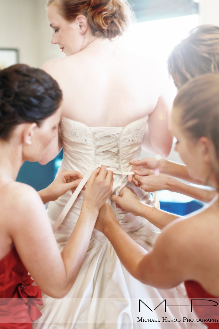
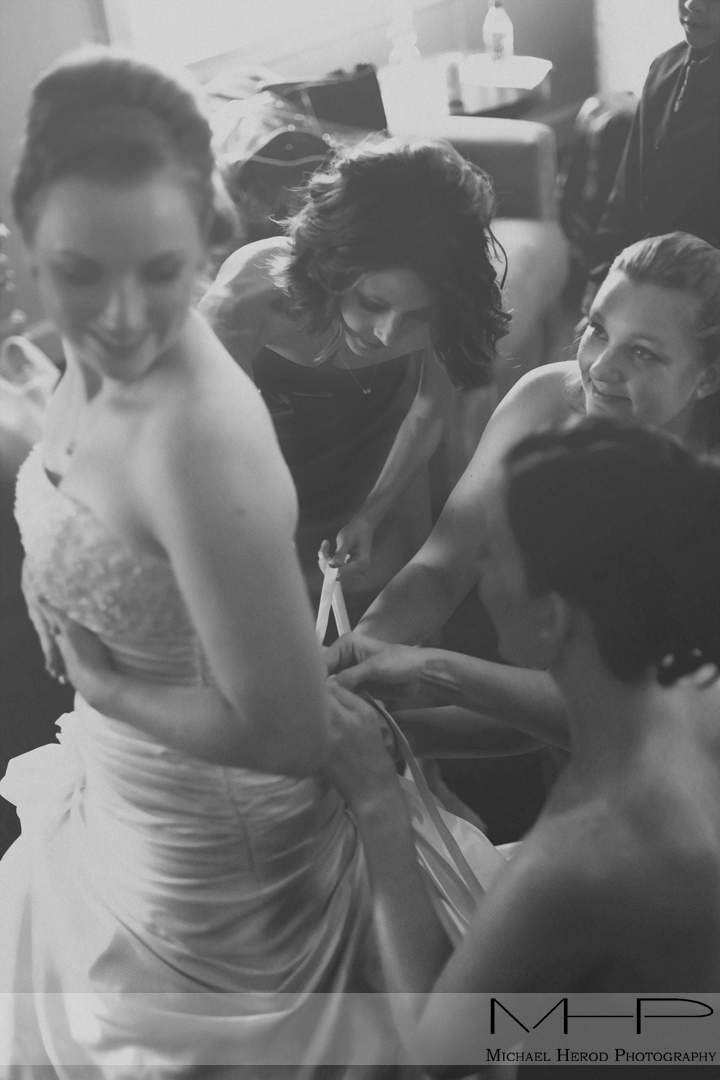
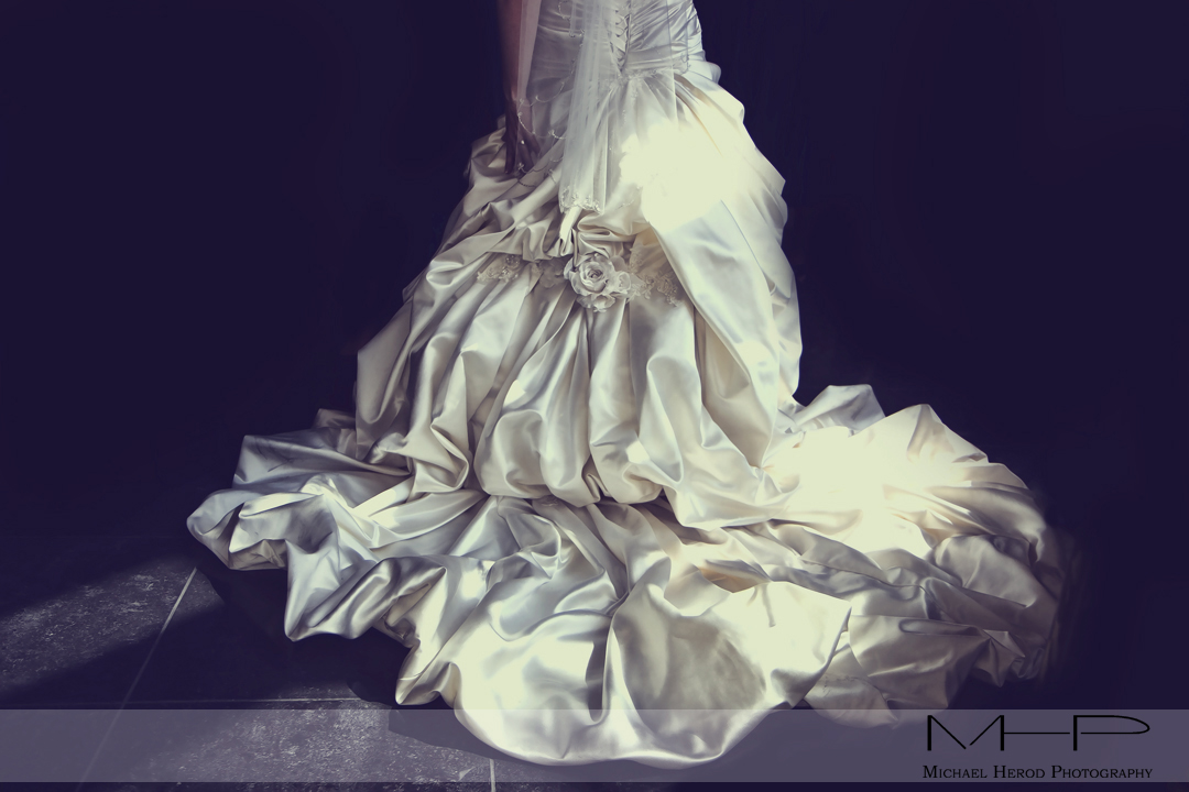
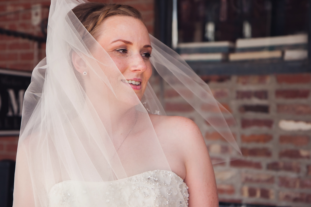
Right now I really want to improve on framing a shot well to tell a story or create a unique image so I’m curious to your thoughts here. Please keep in mind these are planned or posed photos so the posing isn’t always as ideal as we would like though in the 1st one we asked her to close her eyes.
11:33 am
August 10, 2012
 Offline
I like the last photo best, its clean and good fokus on the eyes.
First photo i think is to bright, and a bit mush going on and i whould like more dept of field. Second photo is a mess. To mush going on. Third photo misses the top half.
3:00 pm
November 22, 2012
 Offline
Madman said
I like the last photo best, its clean and good fokus on the eyes.
First photo i think is to bright, and a bit mush going on and i whould like more dept of field. Second photo is a mess. To mush going on. Third photo misses the top half.
I hope the couple had not pay a dime. I am Right?![]()
4:13 pm
January 28, 2013
 Offline
Silky said
Madman said
I like the last photo best, its clean and good fokus on the eyes.
First photo i think is to bright, and a bit mush going on and i whould like more dept of field. Second photo is a mess. To mush going on. Third photo misses the top half.I hope the couple had not pay a dime. I am Right?
1st photo is intentionally soft with more focus on the lace of the dress and hand with a softer focus on her face and blown highlights for more of a fantasy feel, but you might be right on the highlights being overdone. I also think the color is off in the face when I look at it sometimes too, maybe too much contrast?
2nd photo, I agree on the mush, sometimes I like it other times I don’t. It’s a bridal sweet with the brides maids helping the bride get ready, it’s an integral part of her day so it is a busy photo to capture the emotion of her day.
Yes, the 3rd photo is framed so the focus is on the dress and not the bride, they pay a lot of money for the dresses so we get photos out of 2-3 thousand we take in the day that focus on just the dress, if think she paid over $3,000 for the dress if i remember right.
They paid a for the photos and after seeing the photos reccomended friends to us. ![]()
5:02 pm
November 22, 2012
 Offline
MHP Mike said
Silky said
Madman said
I like the last photo best, its clean and good fokus on the eyes.
First photo i think is to bright, and a bit mush going on and i whould like more dept of field. Second photo is a mess. To mush going on. Third photo misses the top half.I hope the couple had not pay a dime. I am Right?
1st photo is intentionally soft with more focus on the lace of the dress and hand with a softer focus on her face and blown highlights for more of a fantasy feel, but you might be right on the highlights being overdone. I also think the color is off in the face when I look at it sometimes too, maybe too much contrast?
2nd photo, I agree on the mush, sometimes I like it other times I don’t. It’s a bridal sweet with the brides maids helping the bride get ready, it’s an integral part of her day so it is a busy photo to capture the emotion of her day.
Yes, the 3rd photo is framed so the focus is on the dress and not the bride, they pay a lot of money for the dresses so we get photos out of 2-3 thousand we take in the day that focus on just the dress, if think she paid over $3,000 for the dress if i remember right.
They paid a for the photos and after seeing the photos reccomended friends to us.
Sure I belive you ; you are a lucky man, there is a saying that said” in the land of blind, the the one-eyed is king, overall when people cannot distinguish between an Oleo and a litography.
I have to rise may rate.
Thank you for the info.
Good luck and continue , you are a King![]()
11:16 pm
VIP Student
January 19, 2013
 Offline
9:41 am
July 25, 2012
 Offline
Hi Photo King (never understood why people don’t use their real names, it could be a way of promote their work, promoting their name, right?). About the photos, I loved the 1st one, because of the highlights, very bright and it goes well with the theme. Loved the composition and the moment (it’s a very important moment for the bride and the ladies of honor) I find funny because in Portugal we haven’t that tradition. About the other photos, the black and white looks to grey without contrast, the onde with the dress is cutted (you cutted the person inside dress) although it is an expensive dress…no way we cut the person on that proportion. About the last one, I guess you could use a lens with more boket, I can see well the bricks on the bottom, and it distracts from the bride.
Good job, keep on posting. ![]()
9:37 pm
January 28, 2013
 Offline
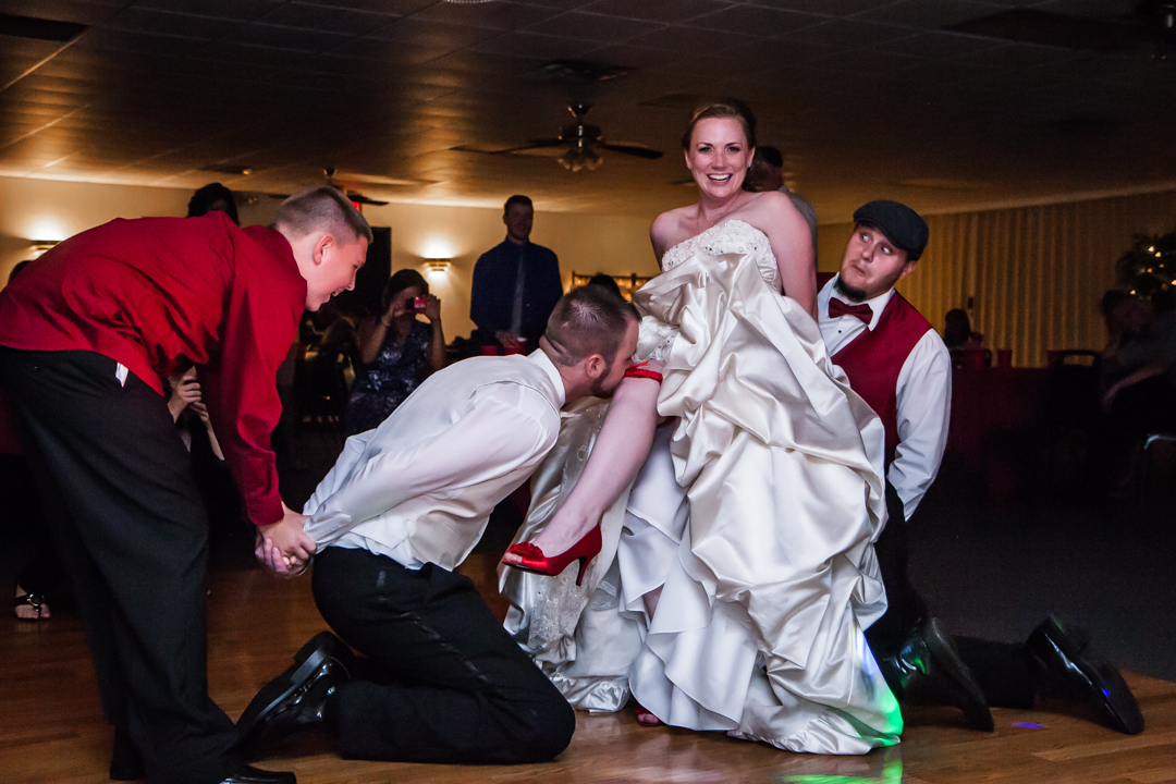
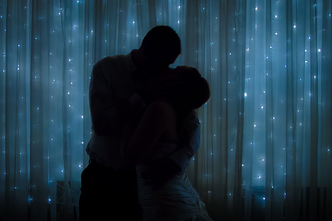
A couple more fun ones from the same wedding.
All in all we delivered just over 500 fully edited photographs to the client, I want to add we don’t hand over burst mode photos, each of the 500 photos is unique to itself.
And yes the last one is underexposed, as intended, the couple knows who they are and love the photo.
As for the earlier photo of the top half of the bride being cut, we have a similar one of her not cut in half, it was taken immediately after the ceremony with several dozen people around and doesn’t have the same effect as this one, she prefers the one where she is cropped and ordering a large print to help memorialize her dress.
10:30 pm
October 9, 2012
 Offline
Most Users Ever Online: 1107
Currently Online:
24 Guest(s)
Currently Browsing this Page:
1 Guest(s)
Top Posters:
Mandrake: 2719
nikonguy: 1594
mscharff: 1054
Muneer: 812
Silky: 554
intekhab0731: 553
sameerfulari: 466
Brian Copeland: 449
ergig: 307
Bjørn (Madman): 278
Member Stats:
Guest Posters: 9
Members: 2557
Moderators: 0
Admins: 1
Forum Stats:
Groups: 14
Forums: 87
Topics: 2764
Posts: 15326
Newest Members:
Rollinsparry, maryamsmarthasAdministrators: easyexposure: 2164
 Log In
 Members
 Home
Home


