Welcome to a new Easy Exposure Photo Forum! I hope you will enjoy new features. It is still work in progress, so please be patients. Thanks!
 Topic RSS


 (0 votes)
 8:50 pm
August 5, 2012
 Offline
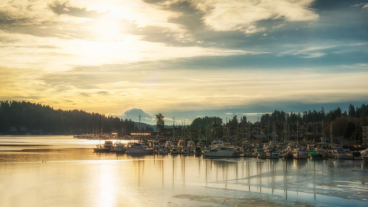
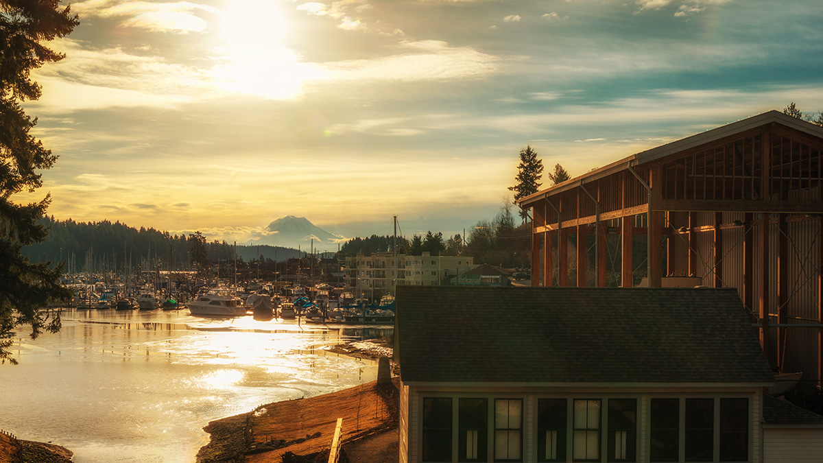
Hello everyone, I really need your help! I am working on a project for a website that will future some local venues in my town and was asked for some photos to put on the front page to show the atmosphere of the town. Its really bad time of the year for landscape photography in washington this were two of my favorite images from the shoot. Please give me some honest critique don’t hold back, its pretty important to me. thank you all .
aleks


12:34 am
September 30, 2012
 Offline
My honest opinion is 1st one is the best among them.
its great atmosphere that when see this picture, really natural shot also good colours. my humble suggestion if you can reduce the light in LR (increase little bit black and highlight all the colours) will produce the excellent result(this is only my own opinion)
in the 2nd shot, there are some distraction in the left side (some branches of tree).
the back ground scenery not focusing due to front house (the small house)
however congrats Aleksandr for these shots
Muneer
5:12 am
VIP Student
March 23, 2013
 Offline
Hey Aleks! Welcome back! We missed you. You always use to surprise us with some great edits. I hope everything is going well!
I really like #1. I must agree that the front house on #2 is a bit distracting. I love the pastel colors and the sky glow reflected in the water. It is a bit blow out, but it doesn’t really bother me. It is what happened when you shoot into the sun. You could have tried to shoot this HDR, but not taking it too extreme. I think the images have very pleasant and calming mood to them.
By the way did you see the web design already? Very ofter it is much more easy to choose the image by seeing the design, color pallet , etc. Sometimes they use different crop then a standard photo. It also can make a difference.
3:13 pm
August 5, 2012
 Offline
Thank you every one!
Oksana, I am doing ok. I have been very busy with work and doing a lot of photography projects in a spear time so didn’t have a lot of free time for interwebs. I mostly shoot portraits, but being in a construction trade I started coming across people in need of architectural photos and I do ok with dose as well, but really struggle with the photos I posted above, simply because I think they are really depend on a personal taste and wanted to here what some of you fine people thought about them. I will try to get more involved with the forum and missed you guys as well.
Aleks.
P.S. Собираюсь поехатъ на родину в Белоруссию, незанаю как впехнуть камеру и всю фото фигню в один чемодан… лол
Most Users Ever Online: 1107
Currently Online:
17 Guest(s)
Currently Browsing this Page:
1 Guest(s)
Top Posters:
Mandrake: 2719
nikonguy: 1594
mscharff: 1054
Muneer: 812
Silky: 554
intekhab0731: 553
sameerfulari: 466
Brian Copeland: 449
ergig: 307
Bjørn (Madman): 278
Member Stats:
Guest Posters: 9
Members: 2557
Moderators: 0
Admins: 1
Forum Stats:
Groups: 14
Forums: 87
Topics: 2764
Posts: 15326
Newest Members:
Rollinsparry, maryamsmarthasAdministrators: easyexposure: 2164
 Log In
 Members
 Home
Home


