Welcome to a new Easy Exposure Photo Forum! I hope you will enjoy new features. It is still work in progress, so please be patients. Thanks!
 Exipure Weight Loss Pills
 Immediate Fortune Review
 Bitcoin Evolution Login >>> Se…
 PHOTO RETOUCHING SERVICE
 Wedding
 My second photo shoot
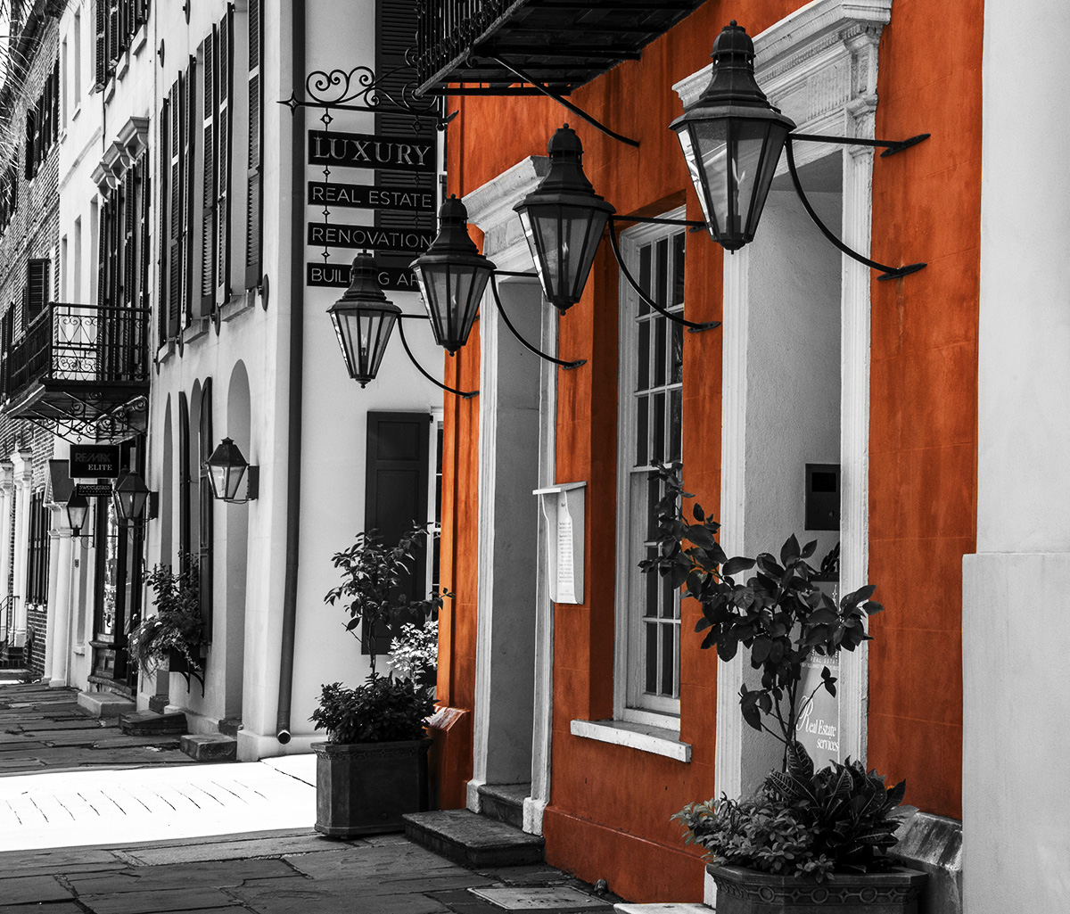
 Color vs Black & White
 Moon
Moon Product photography
 On your mark
 Fine arts.
 My Favorite Photographers
 Topic RSS


 (0 votes)
 9:18 am
VIP Student
March 23, 2013
 Offline
11:37 am
VIP Student
September 15, 2012
 Offline
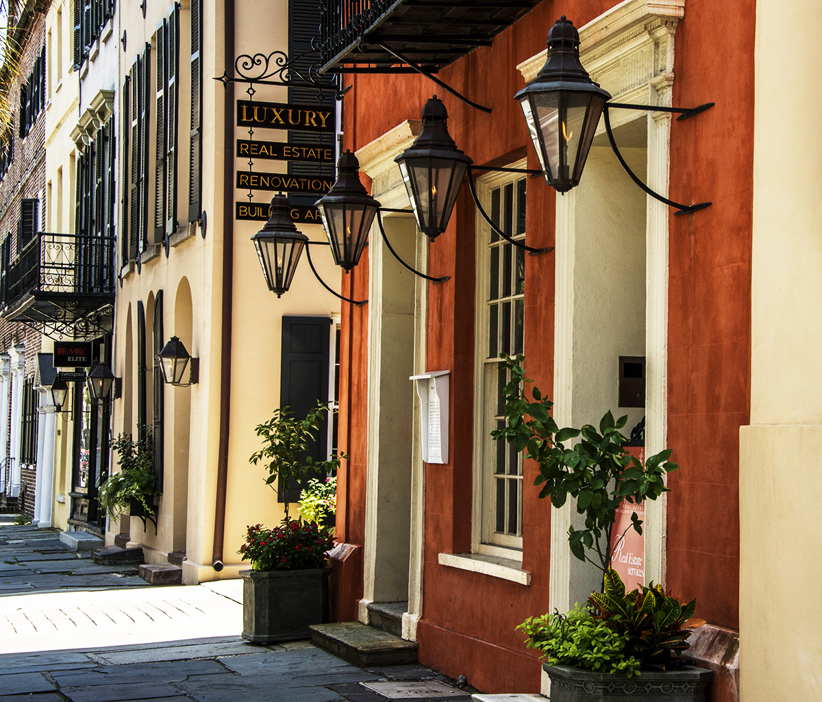
I absolutely love the first shot and suggest to all to click here for higher resolution.
The repeating vertical lines of the buildings give great depth and an immersive feeling of actually being in the photo.
Don’t miss the flickering flames in the lanterns.
My only suggestion would be to eliminate the “straw like lines” at the upper left corner.
I can’t tell what they are and they are a bit of a distraction. I’d also think about replacing the
bright sunlight from the ally with a continuation of the slate sidewalk pavers.
Great shot, Michael. Congratulations. Interesting settings. I see light was a challenge.
Re: the second… Selective color is not my thing.
(I’ll work on finding the exact location, lol)
-- Mandrake --
12:03 pm
VIP Student
September 15, 2012
 Offline
Most Users Ever Online: 1107
Currently Online:
72 Guest(s)
Currently Browsing this Page:
1 Guest(s)
Top Posters:
Mandrake: 2719
nikonguy: 1594
mscharff: 1054
Muneer: 812
Silky: 554
intekhab0731: 553
sameerfulari: 466
Brian Copeland: 449
ergig: 307
Bjørn (Madman): 278
Member Stats:
Guest Posters: 9
Members: 2557
Moderators: 0
Admins: 1
Forum Stats:
Groups: 14
Forums: 87
Topics: 2764
Posts: 15326
Newest Members:
Rollinsparry, maryamsmarthasAdministrators: easyexposure: 2164
 Log In
 Members
 Home
Home


