Welcome to a new Easy Exposure Photo Forum! I hope you will enjoy new features. It is still work in progress, so please be patients. Thanks!
 Topic RSS


 (2 votes)
 7:37 am
VIP Student
September 4, 2012
 Offline
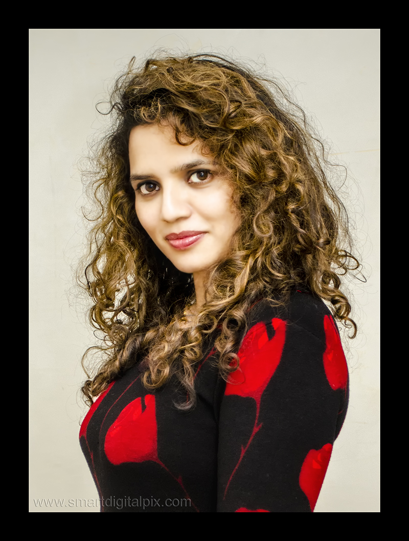
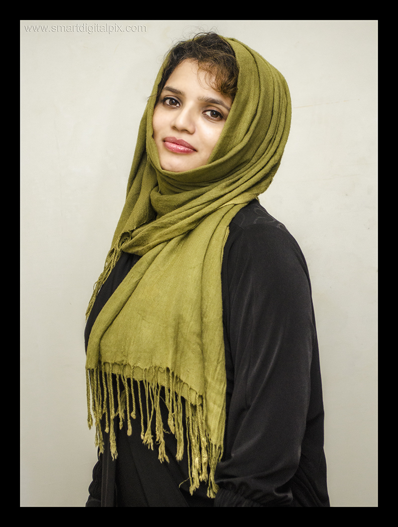
I think that for some reason I like #3 the most. It looks interesting with the scarf. I would maybe clean the background a bit, because I can still see some dots and cracks in the wall. If the whole wall would be like this, it is fine, but now it just looks a bit like dirty background.
I looks a bit like your model doesn’t like her hand, because she is trying to hide them in most of the photos. Am I right?
7:29 am
VIP Student
September 15, 2012
 Offline
8:42 am
VIP Student
January 14, 2014
 Offline
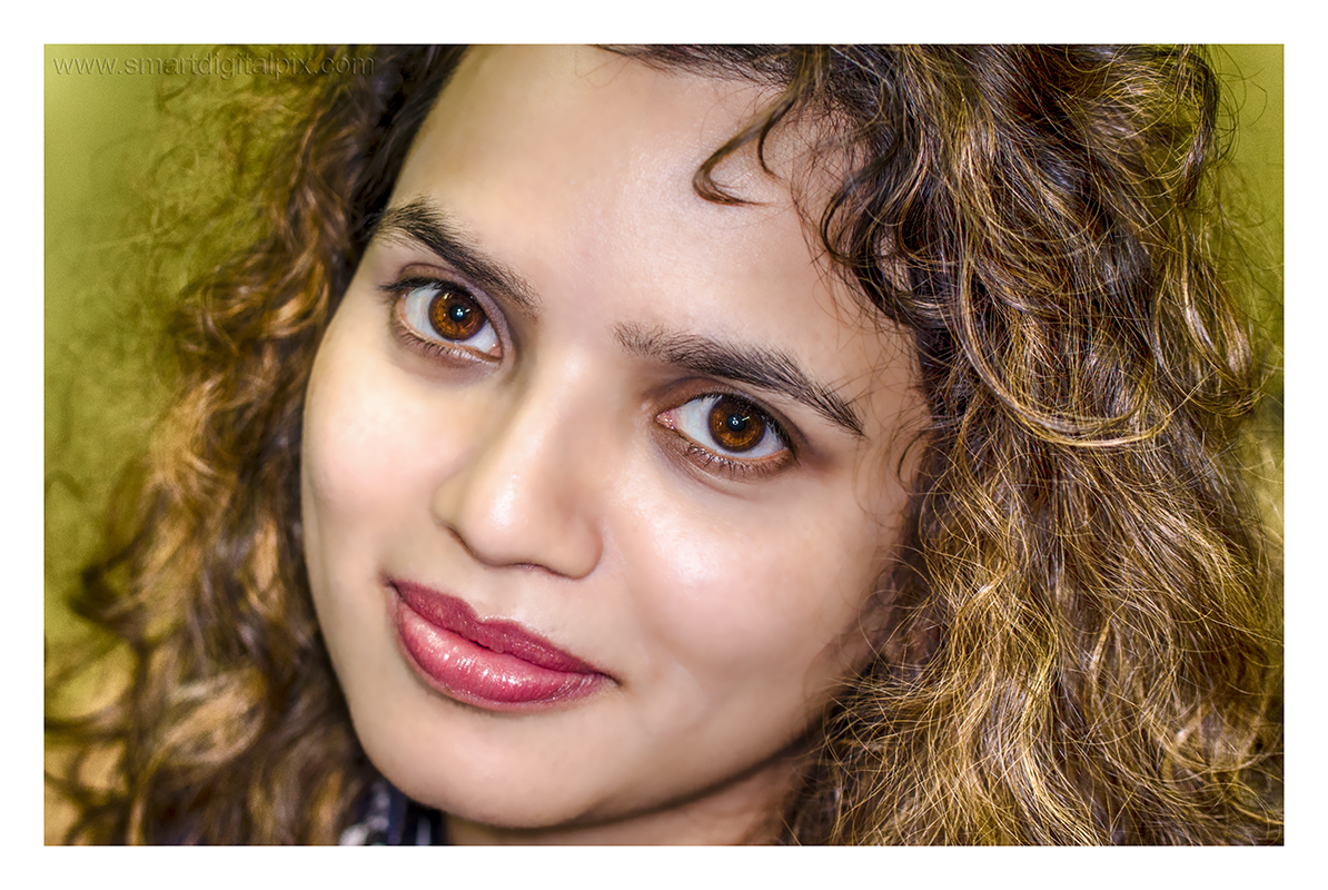
Interesting to see so many different opinions and tastes. I personally prefer the second image because of the nice saturation and sharpness. Her expression is also more positive. And in order to keep the focus on her (beautiful) eyes, I personally would crop the picture just where the hair ends…
9:07 am
VIP Student
September 15, 2012
 Offline
ronald said
I personally prefer the second image because of the nice saturation and sharpness. Her expression is also more positive. And in order to keep the focus on her (beautiful) eyes, I personally would crop the picture just where the hair ends…
I also favor the second, but cropping as suggested would leave the best on the cutting room floor.
-- Mandrake --
10:11 am
VIP Student
March 23, 2013
 Offline
ronald said
Interesting to see so many different opinions and tastes. I personally prefer the second image because of the nice saturation and sharpness. Her expression is also more positive. And in order to keep the focus on her (beautiful) eyes, I personally would crop the picture just where the hair ends…
Where are you looking Ronald? This cropping is fine with me. I still look at her eyes, lol
11:59 am
VIP Student
January 14, 2014
 Offline
easyexposure said
ronald said
Interesting to see so many different opinions and tastes. I personally prefer the second image because of the nice saturation and sharpness. Her expression is also more positive. And in order to keep the focus on her (beautiful) eyes, I personally would crop the picture just where the hair ends…Where are you looking Ronald? This cropping is fine with me. I still look at her eyes, lol
![]() I should have seen that coming Oksana
I should have seen that coming Oksana ![]() But actually I wàs looking at her eyes! I was just concerned about the other guys, ha, ha!
But actually I wàs looking at her eyes! I was just concerned about the other guys, ha, ha!
12:13 pm
VIP Student
September 15, 2012
 Offline
8:41 am
VIP Student
September 4, 2012
 Offline
8:45 am
VIP Student
September 4, 2012
 Offline
I really like the last portrait, Intekhab. The only thing I would suggest to pull back a bit on the skin smoothening, so she doesn’t look too plastic. You have some areas (on the forehead where there is a peace of hair), which were not effected and you can still see some pores, unlike the other parts of her face. It makes retouching very obvious. If you would pull back just a bit on smoothening it will look a bit more natural.
2:56 am
VIP Student
September 4, 2012
 Offline
12:53 pm
VIP Student
March 23, 2013
 Offline
1:55 pm
VIP Student
January 14, 2014
 Offline
4:56 am
VIP Student
December 2, 2012
 Offline
Most Users Ever Online: 1107
Currently Online:
42 Guest(s)
Currently Browsing this Page:
1 Guest(s)
Top Posters:
Mandrake: 2719
nikonguy: 1594
mscharff: 1054
Muneer: 812
Silky: 554
intekhab0731: 553
sameerfulari: 466
Brian Copeland: 449
ergig: 307
Bjørn (Madman): 278
Member Stats:
Guest Posters: 9
Members: 2557
Moderators: 0
Admins: 1
Forum Stats:
Groups: 14
Forums: 87
Topics: 2764
Posts: 15326
Newest Members:
Rollinsparry, maryamsmarthasAdministrators: easyexposure: 2164
 Log In
 Members
 Home
Home


