Welcome to a new Easy Exposure Photo Forum! I hope you will enjoy new features. It is still work in progress, so please be patients. Thanks!
 Topic RSS


 (0 votes)
 4:24 am
August 5, 2012
 Offline
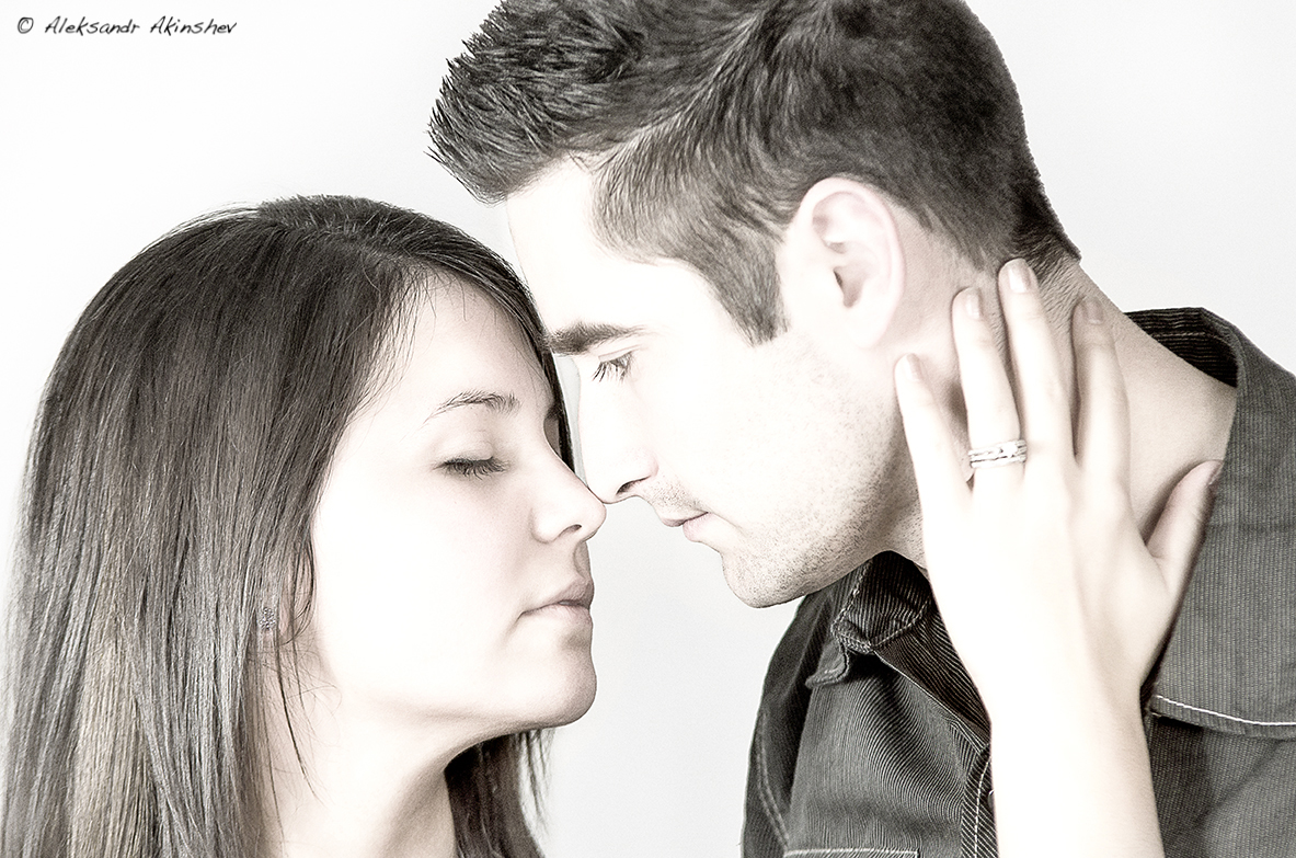
This one is another shot from recent photo shoot (same models that are in the silhouette). During post processing I accidentally came across this effect with some blending modes and adjustment layers. I kind a liked the end result, I think it adds an intimate fill to it. I would like to here some of your opinions.

1:32 pm
VIP Student
September 15, 2012
 Offline
Vitfoto,
Love the pose, definitely romantic. However, it seems a bit overexposed in my humble opinion. But perhaps from an artistic point of view might be ok. At the end, “beauty is in the eye of the beholder”
Was this shot in a studio? was it shot in black & white? How does the unprocessed photograph compare to this one?
Love, Monkey
Thank you all for comments, I see what you mean about the photo being over exposed I was definitely braking some rules here. I was trying to recreate a look that I saw on one of my favorite photographers photo (Joel Grimes) Here is the link to the photo [/url]
I know its not anywhere near close to what he has but this is all I could do with what I had.
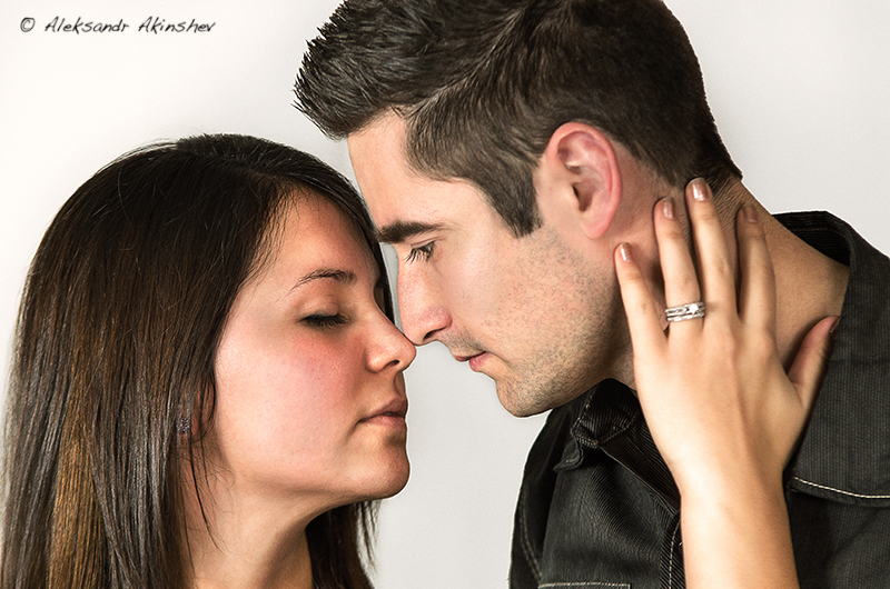
I am attaching another edit of this image for you guys to check out.
This was photographed with a semi-studio set up.
White backdrop with 2 speed lights with silver reflective umbrellas.
70-200mm f2.8
Here is how I got the effect in photoshop.
After my normal editing, I created a hue/saturation adjustment layer after disaturating everything change the blending mode to screen, adjusted the opacity to my liking.
Aleksandr

I like the photo in color more. Nice composition and you can see their feeling. I maybe would prefer it without arm. It feel a bit like it growing from nowhere and my focus wonders between their kiss and the arm. But maybe it is just me.
I know what you where going for with the first look, but it is not quite there yet or maybe it just doesn’t work for this particular image. Keep on trying, maybe with a different subject.
Also my thing is, if you know the rules, you can break them. Photography is an art and different people see art differently.
Show the image to the couple, they might actually love it.
I know what you guys saying about the arm it has been bothering me since I saw the pictures in lightroom after uploading from the card, but unfortunately all of the pictures with this pose have arm there I could try and clone it out but its to much time(which I dont have) and I think on close up portrait like this it will be close to impossible to make it look natural. I guess it will be a lesson for me, to pay attention for this things in the future.
Oksana, the models are my brother in law and his wife, they actually made the first picture their Facebook profile picture so I guess they liked it. What I have learned over the years I have been in photography that most people that you photograph don’t know composition and lighting rules, they only care to look good on the picture ( the way they think they look good).
Hello again vitfoto,
After seeing the picture where you got your inspiration from, I can say you got very close to duplicating the style of that photo.
Thanks for posting the color picture for comparison. It’s a great photograph.
I agree with Oksana that the arm can be a bit distracting. But otherwise it’s a great photo. There are some guidelines (which are not set on stone, meaning can be broken) of where you should crop a photograph. and again, these are suggestions. They say not to cut/crop a photo at the wrist, ankle, elbow for example. This is something you can think of when framing the shot. It has helped me in some situations. This arm coming from nowhere is like some of the pictures I’ve taken of people with a light pole behind them, when I go to process the photo I see the light pole sticking out of their heads. lol..It takes practice and awareness and it all comes down to practice, practice, practice. Once again excellent photo!!
Love, Monkey
7:03 am
August 5, 2012
 Offline
Monkey, I think the day our own photos will start to impress us it the day we should start worry. As long as we will be our hardest critique, we are learning and improving. The thing that sucks it that you only see the mistakes and problems after.
Rosskae, on the close up portrait like this one cropping a bit of the hair is not a problem a lot of photographers actually do it on purpose, when it is a full body shot or regular portrait then is a problem.
Most Users Ever Online: 1107
Currently Online:
27 Guest(s)
Currently Browsing this Page:
1 Guest(s)
Top Posters:
Mandrake: 2719
nikonguy: 1594
mscharff: 1054
Muneer: 812
Silky: 554
intekhab0731: 553
sameerfulari: 466
Brian Copeland: 449
ergig: 307
Bjørn (Madman): 278
Member Stats:
Guest Posters: 9
Members: 2557
Moderators: 0
Admins: 1
Forum Stats:
Groups: 14
Forums: 87
Topics: 2764
Posts: 15326
Newest Members:
Rollinsparry, maryamsmarthasAdministrators: easyexposure: 2164
 Log In
 Members
 Home
Home


