Welcome to a new Easy Exposure Photo Forum! I hope you will enjoy new features. It is still work in progress, so please be patients. Thanks!
 Topic RSS


 (0 votes)
 4:59 am
February 8, 2013
 Offline
hello
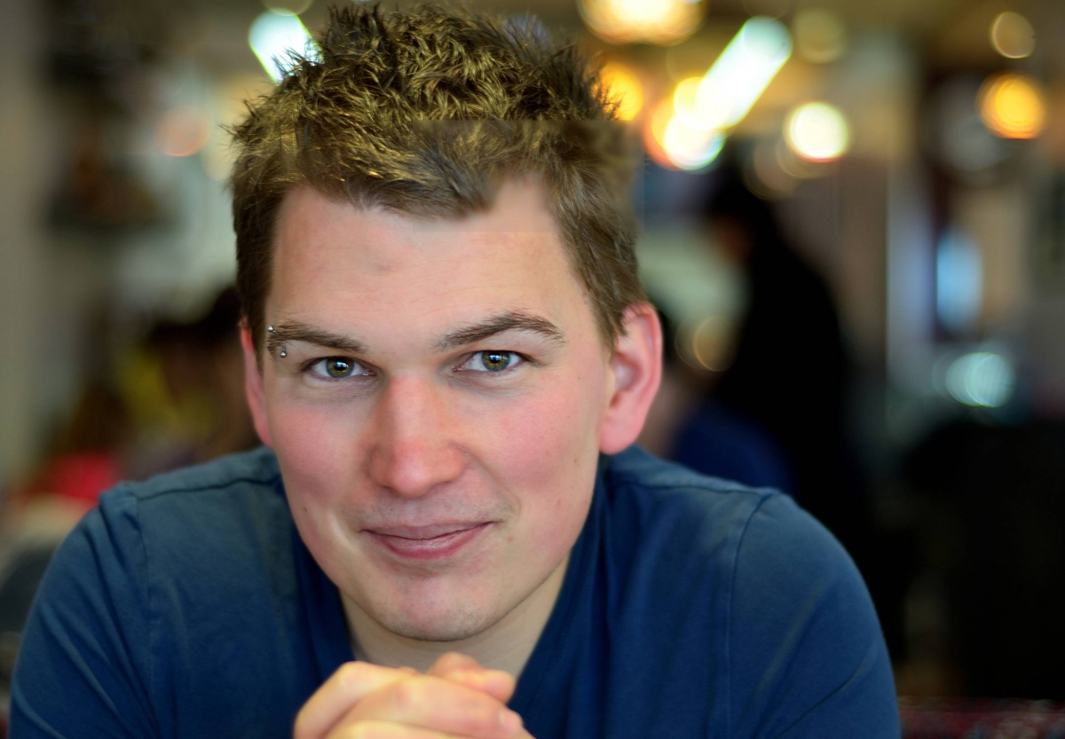
I’m not an expert, but for me it seems like not fully controlled post production. I can see large squares of blur area.
I know, blurry background on portrait looks more artistic , but don’t over blur (to much effect can destroy overall feelings about picture).
Lights on left top corner are a bit distracting. If I can suggest, please make these lights darker instead of adding blur.
Best regards
B.S.E.
5:37 am
VIP Student
September 15, 2012
 Offline
B.S.E…..
The camera settings have been removed from the file’s property details so
it difficult to judge the cause of bokeh. I’m betting it’s real though… ie, from the camera
rather than done in post. It’s easy to blur in post, but adding the light circles… not so much.
And why add them where they are?
The bright white lights are distracting, giving a “devilish look”.
I’m not going to mention the piercing.
Rats… I did.
Mandrake
-- Mandrake --
6:09 am
February 8, 2013
 Offline
7:19 am
VIP Student
September 4, 2012
 Offline
Most Users Ever Online: 1107
Currently Online:
39 Guest(s)
Currently Browsing this Page:
1 Guest(s)
Top Posters:
Mandrake: 2719
nikonguy: 1594
mscharff: 1054
Muneer: 812
Silky: 554
intekhab0731: 553
sameerfulari: 466
Brian Copeland: 449
ergig: 307
Bjørn (Madman): 278
Member Stats:
Guest Posters: 9
Members: 2557
Moderators: 0
Admins: 1
Forum Stats:
Groups: 14
Forums: 87
Topics: 2764
Posts: 15326
Newest Members:
Rollinsparry, maryamsmarthasAdministrators: easyexposure: 2164
 Log In
 Members
 Home
Home


