Welcome to a new Easy Exposure Photo Forum! I hope you will enjoy new features. It is still work in progress, so please be patients. Thanks!
 Topic RSS


 (0 votes)
 2:07 pm
November 22, 2012
 Offline
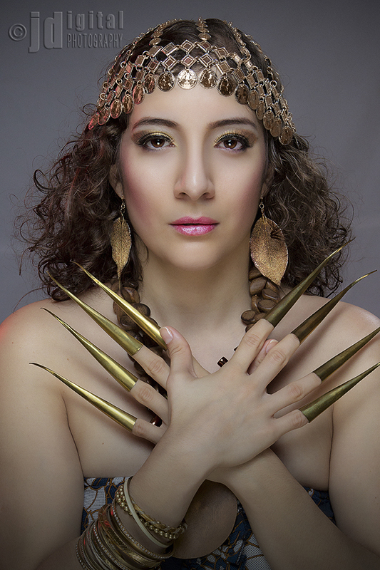
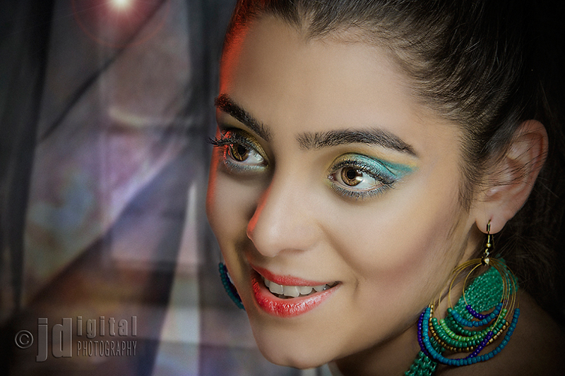
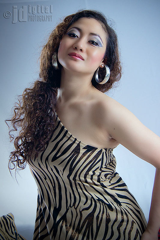
nuhjcom@ya-hoo.com; Excelenct job, every thing is okey ilumination makeup and of course the photograper play the first role here.
Between al the sencond is the best to my teste.
Did you got any award?
congratulation.
4:06 pm
VIP Student
December 2, 2012
 Offline
Great photos, Jhun. If I would want to improve, I would make the hands position in the first photo more symmetrical. Because now it is a bit to the right and cutting on the finger “extensions”. In the “straight on centered” photos like this, it is all about the symmetry. Sometimes photographers even mirror one side (it would not work for this image so).
On the third photo, I would remove a piece of fabric in the lower left corner. It is a bit distracting and my eye keeps on going there.
I think you did a great job on reattaching. I would just work a bit more on the armpit on the third photo. This is almost always a problem aria. On the second photo you should maybe apply a bit of teeth whitening.
10:18 pm
VIP Student
December 2, 2012
 Offline
Most Users Ever Online: 1107
Currently Online:
65 Guest(s)
Currently Browsing this Page:
1 Guest(s)
Top Posters:
Mandrake: 2719
nikonguy: 1594
mscharff: 1054
Muneer: 812
Silky: 554
intekhab0731: 553
sameerfulari: 466
Brian Copeland: 449
ergig: 307
Bjørn (Madman): 278
Member Stats:
Guest Posters: 9
Members: 2557
Moderators: 0
Admins: 1
Forum Stats:
Groups: 14
Forums: 87
Topics: 2764
Posts: 15326
Newest Members:
Rollinsparry, maryamsmarthasAdministrators: easyexposure: 2164
 Log In
 Members
 Home
Home


