Welcome to a new Easy Exposure Photo Forum! I hope you will enjoy new features. It is still work in progress, so please be patients. Thanks!
 Topic RSS


 (0 votes)
 11:43 am
VIP Student
March 23, 2013
 Offline
2:07 pm
VIP Student
September 15, 2012
 Offline
4:23 am
VIP Student
March 23, 2013
 Offline
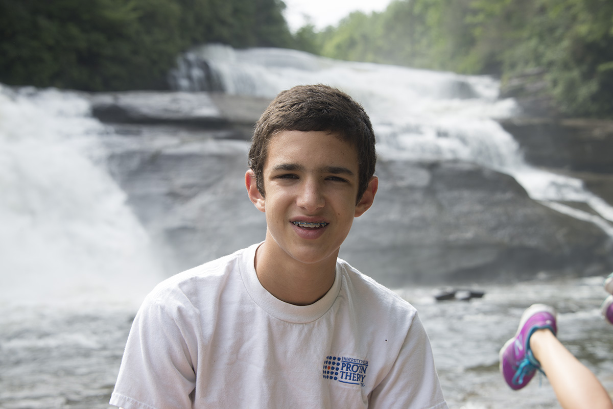
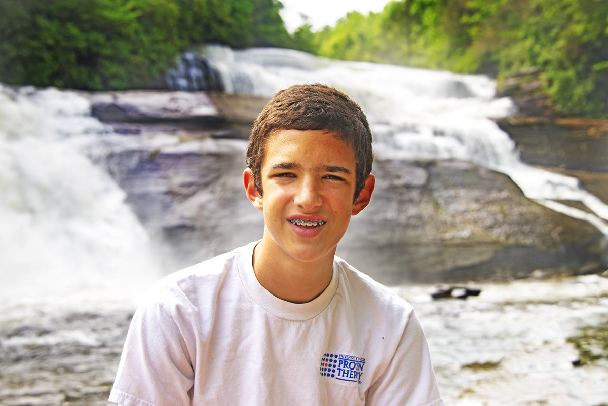
Feet didn’t belong in there clearly. It is kind of funny so. I think you overdone with saturation. It is ok for background, but his face looks like pumpkin – way too orange. You have to be careful with over saturating skin tones. It is always safer to use vibrance instead of saturation. It is a bit overexposed. You can see that the most on his shoulder. You are loosing details in white shirt.
I like Mandrake’s of center composition.
Most Users Ever Online: 1107
Currently Online:
61 Guest(s)
Currently Browsing this Page:
1 Guest(s)
Top Posters:
Mandrake: 2719
nikonguy: 1594
mscharff: 1054
Muneer: 812
Silky: 554
intekhab0731: 553
sameerfulari: 466
Brian Copeland: 449
ergig: 307
Bjørn (Madman): 278
Member Stats:
Guest Posters: 9
Members: 2557
Moderators: 0
Admins: 1
Forum Stats:
Groups: 14
Forums: 87
Topics: 2764
Posts: 15326
Newest Members:
Rollinsparry, maryamsmarthasAdministrators: easyexposure: 2164
 Log In
 Members
 Home
Home


