Welcome to a new Easy Exposure Photo Forum! I hope you will enjoy new features. It is still work in progress, so please be patients. Thanks!
 Topic RSS


 (0 votes)
 12:07 am
January 18, 2013
 Offline
Hi Silky,
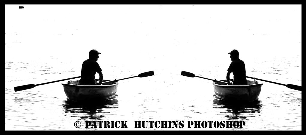
The fishermen image is cool. It could almost be an advertisement image. Just 2 little things, The black spot in the upper left is a little distracting, you could just rubberstamp it out in P-shop. Also when you flop the image be careful not to let it get distorted when you are placing it in position. The fishermen on the right looks a little skinnier than the one on the left. I like the idea. It makes me feel like going with them for a beer! Nice job.
7:34 am
VIP Student
September 15, 2012
 Offline
1:59 pm
August 10, 2012
 Offline
To mush contrast, and i dont like boats… Hate boats..
3:17 pm
VIP Student
September 15, 2012
 Offline
8:18 pm
November 22, 2012
 Offline
picturethis said
Hi Silky,
The fishermen image is cool. It could almost be an advertisement image. Just 2 little things, The black spot in the upper left is a little distracting, you could just rubberstamp it out in P-shop. Also when you flop the image be careful not to let it get distorted when you are placing it in position. The fishermen on the right looks a little skinnier than the one on the left. I like the idea. It makes me feel like going with them for a beer! Nice job.
If the black spot or buyon was there why I need to rubberstamp, if it distracting you , you have to educate your brain follow order.![]()
11:36 pm
August 10, 2012
 Offline
Silky said
Madman said
To mush contrast, and i dont like boats… Hate boats..
Madman, you need to visite a psicriatic, the contrast is correct, next time I will tel the fishermen take a Canoe, Did you like Canoe?
![]() No i dont like canoe.. they tip over to easy. I`m build for walking on land, not sit in a floating tub.
No i dont like canoe.. they tip over to easy. I`m build for walking on land, not sit in a floating tub.
The pic. is still a good one, but as i said, contrast..
7:10 am
November 22, 2012
 Offline
vitfoto said
Patric I don’t mind the black spot and the fact that the guy on the right is skinnier is not a problem. the contrasted silhouette look gives the image a bit of mystery.
The right guys paddle is not in frame and the way it blends with the border of the image is a bit weird.
vitfoto: I understand all that everyones said, but Sir, made it in photoshop is relative easy, difficult is made it in camera, I am practicing now this feature of the camera.
Thank you for your comments.![]()
Most Users Ever Online: 1107
Currently Online:
22 Guest(s)
Currently Browsing this Page:
1 Guest(s)
Top Posters:
Mandrake: 2719
nikonguy: 1594
mscharff: 1054
Muneer: 812
Silky: 554
intekhab0731: 553
sameerfulari: 466
Brian Copeland: 449
ergig: 307
Bjørn (Madman): 278
Member Stats:
Guest Posters: 9
Members: 2557
Moderators: 0
Admins: 1
Forum Stats:
Groups: 14
Forums: 87
Topics: 2764
Posts: 15326
Newest Members:
Rollinsparry, maryamsmarthasAdministrators: easyexposure: 2164
 Log In
 Members
 Home
Home


