Welcome to a new Easy Exposure Photo Forum! I hope you will enjoy new features. It is still work in progress, so please be patients. Thanks!
 Topic RSS


 (0 votes)
 5:30 am
VIP Student
September 15, 2012
 Offline
7:10 am
VIP Student
December 2, 2012
 Offline
10:02 am
January 31, 2013
 Offline
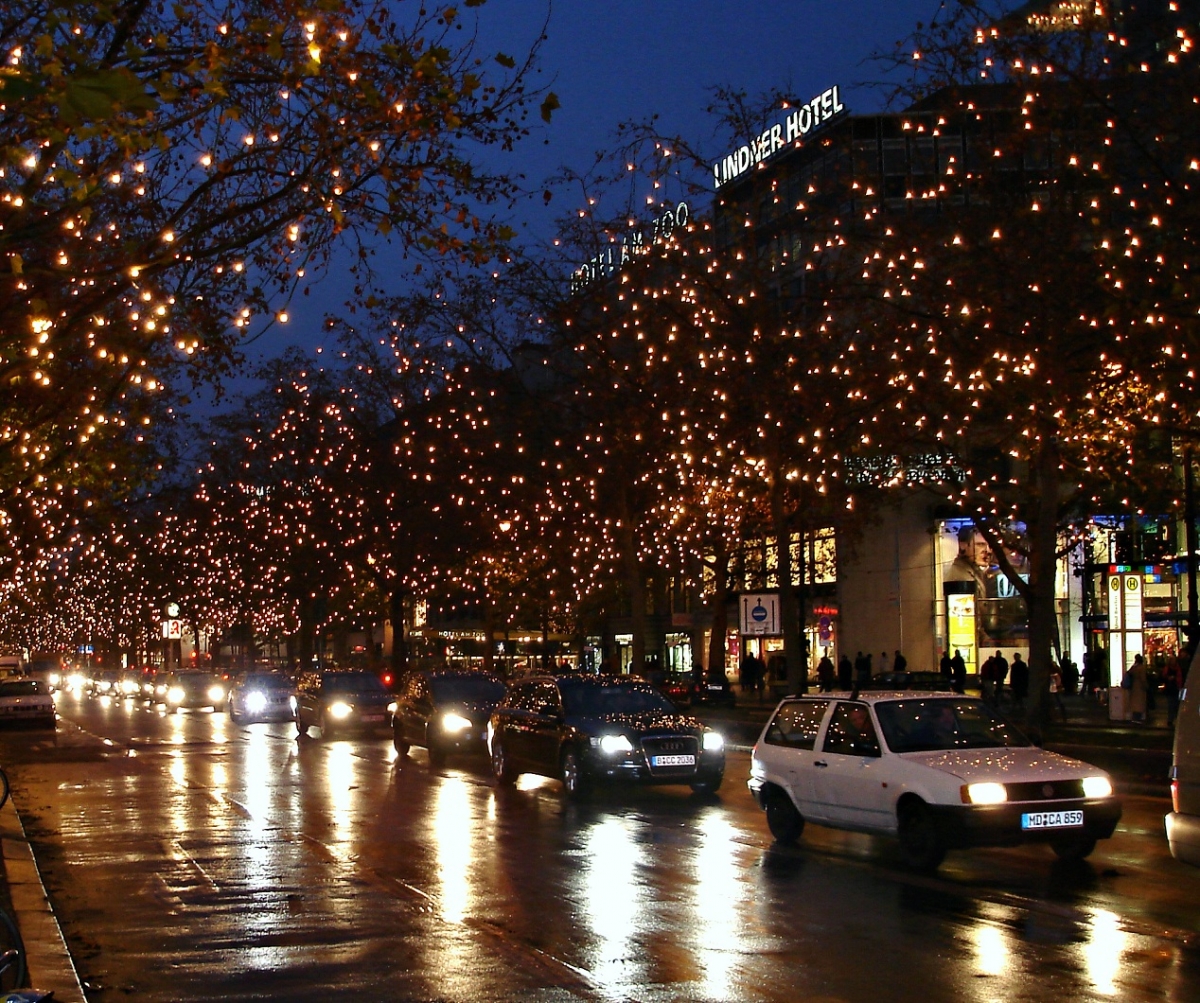
The second is much stronger and interesting to look at, as they are. All the reflections on the ground, the lights in the trees, the hotel sign, the people on the sidewalk, it is busy and exciting.
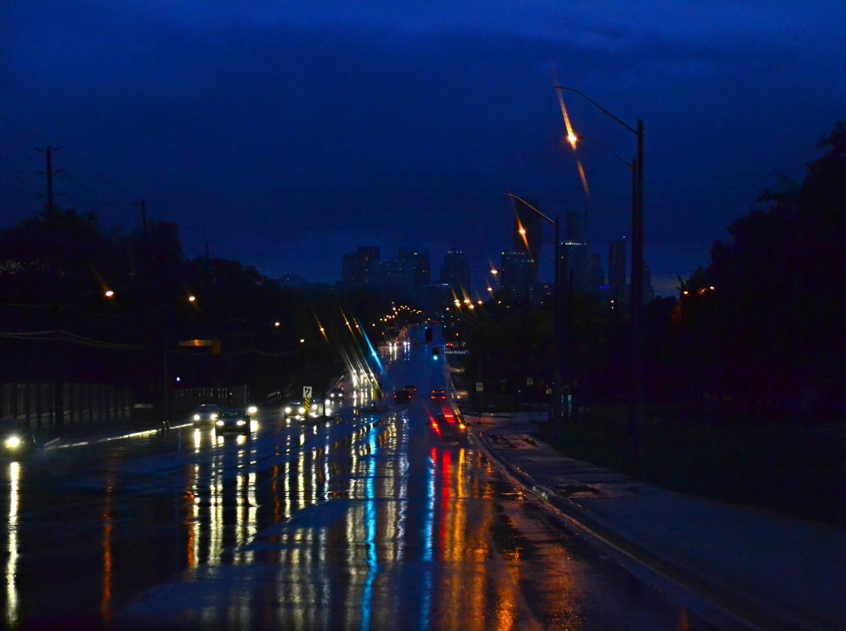
The first one could be made more interesting if the background sky and side of the street would be less dark and if we could see the buildings in the back better, so that we can see where the road leads us.
..:: http://www.brunogallant.info :: Nulla dies sine pictura ::..
Most Users Ever Online: 1107
Currently Online:
32 Guest(s)
Currently Browsing this Page:
1 Guest(s)
Top Posters:
Mandrake: 2719
nikonguy: 1594
mscharff: 1054
Muneer: 812
Silky: 554
intekhab0731: 553
sameerfulari: 466
Brian Copeland: 449
ergig: 307
Bjørn (Madman): 278
Member Stats:
Guest Posters: 9
Members: 2557
Moderators: 0
Admins: 1
Forum Stats:
Groups: 14
Forums: 87
Topics: 2764
Posts: 15326
Newest Members:
Rollinsparry, maryamsmarthasAdministrators: easyexposure: 2164
 Log In
 Members
 Home
Home


