The River Clyde and Cart, Renfrew Scotland, | Nature and Wildlife photos | Photo Forum

Welcome to a new Easy Exposure Photo Forum! I hope you will enjoy new features. It is still work in progress, so please be patients. Thanks!


Avatar

Please consider registering
guest

sp_LogInOut Log In sp_Registration Register sp_MemberList Members

Register | Lost password?
Advanced Search

— Forum Scope —


— Match —


— Forum Options —


Minimum search word length is 3 characters - maximum search word length is 84 characters

sp_Feed Topic RSS sp_TopicIcon
The River Clyde and Cart, Renfrew Scotland,
June 29, 2013
3:01 pm
Avatar
Member
Members
Forum Posts: 31
Member Since:
June 26, 2013
sp_UserOfflineSmall Offline

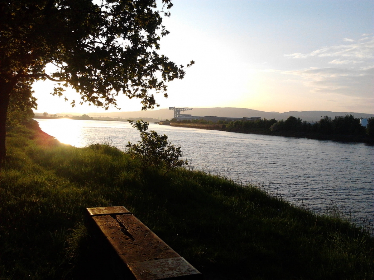
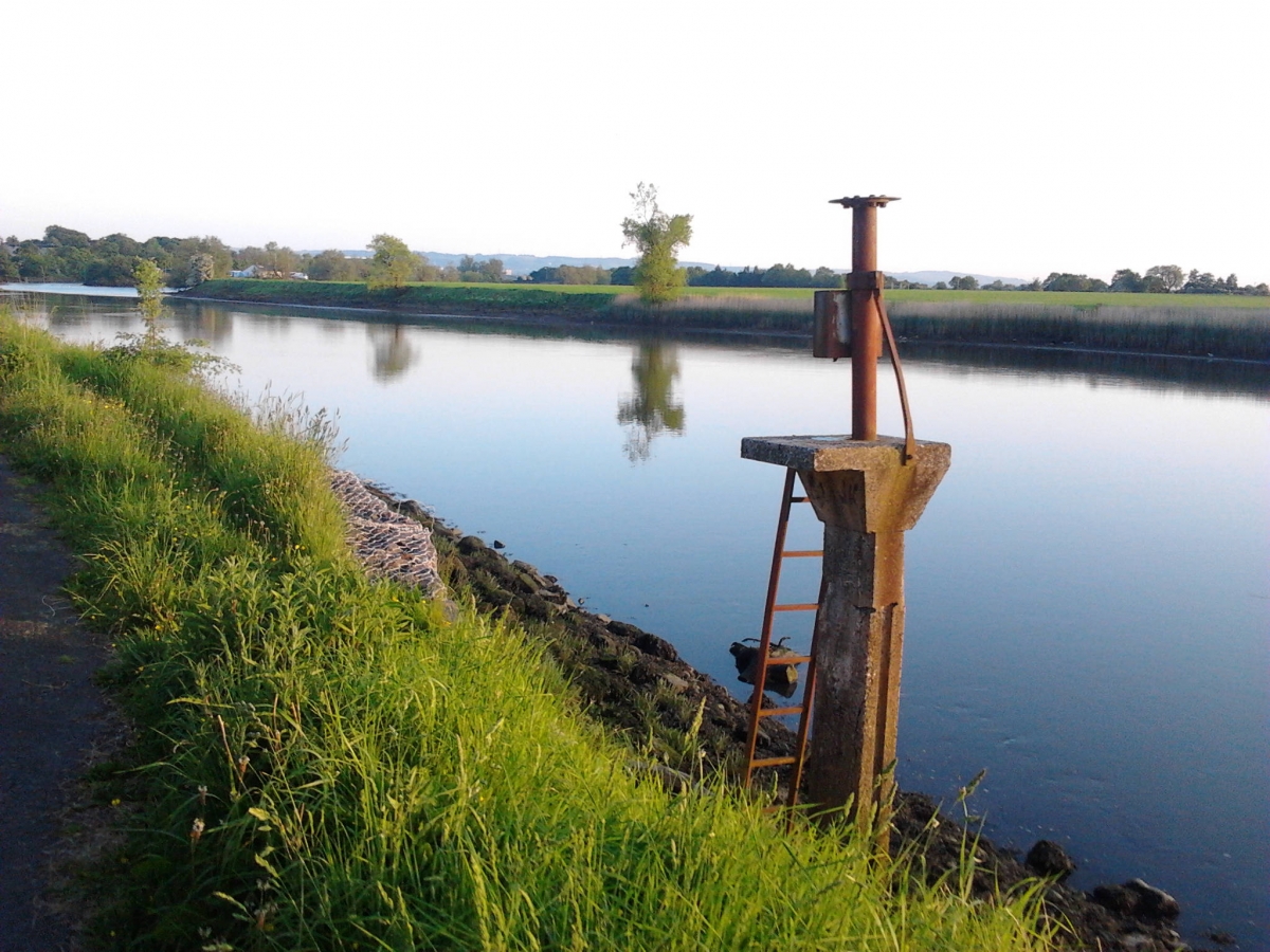
I used my camera phone for these. My main aim was to work on my composition skills. 2013-06-07-21.00.36.jpg2013-06-07-21.07.19.jpg

sp_PlupAttachments Attachments
June 30, 2013
10:02 am
Avatar
Long Island, New York
Member
Members

VIP Student
Forum Posts: 2719
Member Since:
September 15, 2012
sp_UserOfflineSmall Offline

I like the composition.
Watch the horizons.

-- Mandrake --

June 30, 2013
12:00 pm
Avatar
Delft (Netherlands)
Member
Members
Forum Posts: 466
Member Since:
October 9, 2012
sp_UserOfflineSmall Offline

I like the first shot Gary…

Is that a bench from which the light is reflecting ??

Smile

July 1, 2013
9:34 am
Avatar
Member
Members
Forum Posts: 812
Member Since:
September 30, 2012
sp_UserOfflineSmall Offline

I like the 1st picture, nice composition.Smile

Muneer

July 1, 2013
2:12 pm
Avatar
Member
Members
Forum Posts: 31
Member Since:
June 26, 2013
sp_UserOfflineSmall Offline

Yes it is a bench.
Thanks again everyone for your compliments and advice.


July 2, 2013
7:30 am
Avatar
Member
Members

VIP Student
Forum Posts: 1594
Member Since:
December 2, 2012
sp_UserOfflineSmall Offline

OK – I’ll be the odd man out!

I like the 2nd shot because it has a strong focus point and

the background doesn’t distract from it. I also like the way that

the river and grass lines guide your eye to the foreground object.

The entire composition just works for me better than the 1st shot

that has a blown out area on the right and a very dark foreground.

Dale.


Forum Timezone: America/Los_Angeles

Most Users Ever Online: 239

Currently Online:
51 Guest(s)

Currently Browsing this Page:
1 Guest(s)

Top Posters:

Mandrake: 2719

nikonguy: 1594

mscharff: 1054

Muneer: 812

Silky: 554

intekhab0731: 553

sameerfulari: 466

Brian Copeland: 449

ergig: 307

Bjørn (Madman): 278

Member Stats:

Guest Posters: 7

Members: 2765

Moderators: 0

Admins: 1

Forum Stats:

Groups: 14

Forums: 87

Topics: 2908

Posts: 15556

Administrators: easyexposure: 2164

Comments are closed.