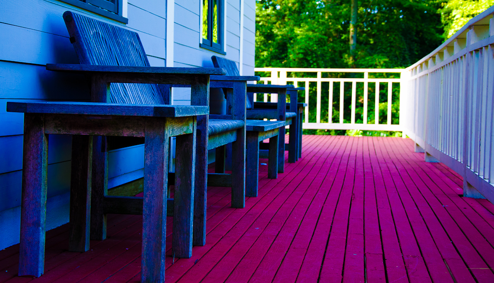
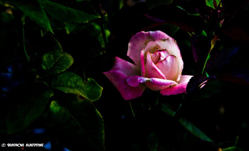
Welcome to a new Easy Exposure Photo Forum! I hope you will enjoy new features. It is still work in progress, so please be patients. Thanks!
 Topic RSS
Quote from Alaeddine on July 26, 2012, 21:25
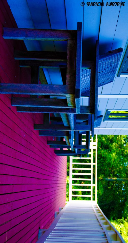
Yes, the second image was rotated on purpose.
I like it. Cool color combinations, lines and shapes. I just would like to see it rotated back to normal. Also could you please explain why you decided to rotate it the way you did? Don’t get me wrong, there is nothing wrong with it. Photography is an art and everybody sees it in a different way. I just want to understand your way of thinking.
Quote from easyexposure on July 26, 2012, 22:49
Quote from Alaeddine on July 26, 2012, 21:25
Yes, the second image was rotated on purpose.I like it. Cool color combinations, lines and shapes. I just would like to see it rotated back to normal. Also could you please explain why you decided to rotate it the way you did? Don’t get me wrong, there is nothing wrong with it. Photography is an art and everybody sees it in a different way. I just want to understand your way of thinking.
Hi Oksana,
All of your critics, ideas and suggestions are welcome. I’m posting my pictures to hear your feedback and to improve my work. I rotated the picture because I thought that the viewer would pay attention to the magenta area. And if I rotate the picture, the convergent lines of the magenta area would give more depth to the picture.
Thank you.

Most Users Ever Online: 1107
Currently Online:
29 Guest(s)
Currently Browsing this Page:
1 Guest(s)
Top Posters:
Mandrake: 2719
nikonguy: 1594
mscharff: 1054
Muneer: 812
Silky: 554
intekhab0731: 553
sameerfulari: 466
Brian Copeland: 449
ergig: 307
Bjørn (Madman): 278
Member Stats:
Guest Posters: 9
Members: 2557
Moderators: 0
Admins: 1
Forum Stats:
Groups: 14
Forums: 87
Topics: 2764
Posts: 15326
Newest Members:
Rollinsparry, maryamsmarthasAdministrators: easyexposure: 2164
 Log In
 Members
 Home
Home

 Offline


