Rider | Nature and Wildlife photos | Photo Forum

Welcome to a new Easy Exposure Photo Forum! I hope you will enjoy new features. It is still work in progress, so please be patients. Thanks!


Avatar

Please consider registering
guest

sp_LogInOut Log In sp_Registration Register sp_MemberList Members

Register | Lost password?
Advanced Search

— Forum Scope —


— Match —


— Forum Options —


Minimum search word length is 3 characters - maximum search word length is 84 characters

sp_Feed Topic RSS sp_TopicIcon
Rider
June 16, 2013
8:36 pm
Avatar
Montreal, Canada
Member
Members
Forum Posts: 65
Member Since:
January 31, 2013
sp_UserOfflineSmall Offline

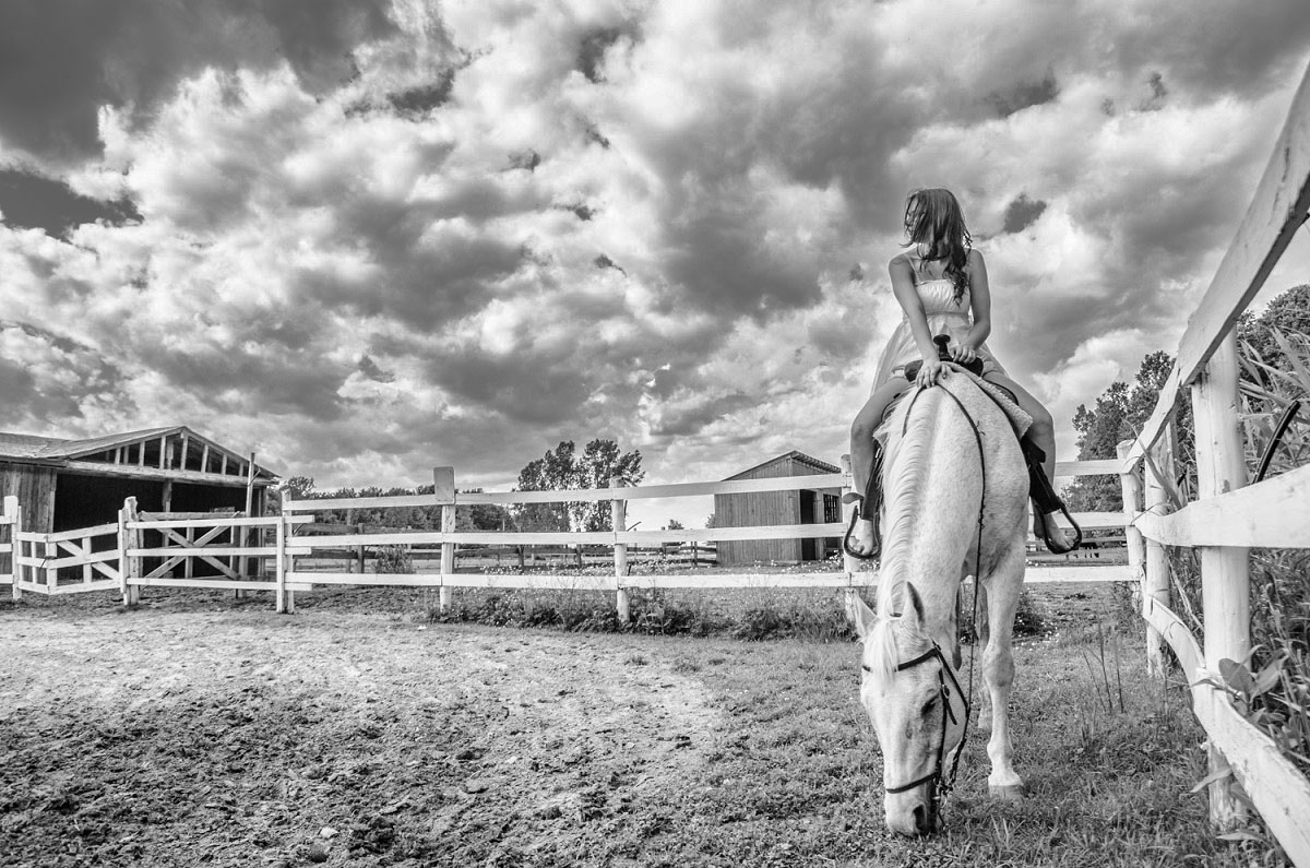
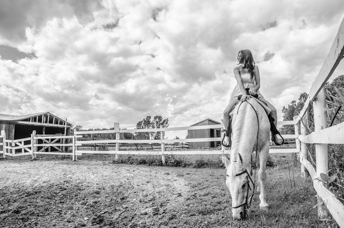
I was not sure where to put this image…  An image from an awesome shoot I did last Saturday.
 

20130615T154428.jpg

sp_PlupAttachments Attachments

..:: http://www.brunogallant.info :: Nulla dies sine pictura ::..

June 17, 2013
4:56 am
Avatar
Spartanburg, SC
Member
Members

VIP Student
Forum Posts: 1054
Member Since:
March 23, 2013
sp_UserOfflineSmall Offline

I really like the shot… I think adding some more contrast to the sky would add depth to the shot… but it just may be me… see below (hope you don’t mind me changing the picture…).contrast.jpg

sp_PlupAttachments Attachments
June 17, 2013
7:35 am
Avatar
Montreal, Canada
Member
Members
Forum Posts: 65
Member Since:
January 31, 2013
sp_UserOfflineSmall Offline

I kind of like the high key look of the original. I have other shots with the sky with as much contrast as your edit.  I will try to post it tonight.


Thanks for the comments.

..:: http://www.brunogallant.info :: Nulla dies sine pictura ::..

June 20, 2013
7:15 pm
Avatar
Member
Members

VIP Student
Forum Posts: 1594
Member Since:
December 2, 2012
sp_UserOfflineSmall Offline

Really interesting picture!

Personally I think the second image with the added contrast

gives a greater sense of dof here.

Either way you’ve created an image that has a lot of good

elements going for it and grabs your attention.

Dale.

June 21, 2013
5:39 pm
Avatar
Admin
Forum Posts: 2164
Member Since:
August 11, 2011
sp_UserOfflineSmall Offline

Lovely image Bruno! Great composition and leading lines. Model looks natural. Low angle gives the viewer feeling on hight being on a horse.  Now then I saw both version, I might go with something in between. 

Forum Timezone: America/Los_Angeles

Most Users Ever Online: 239

Currently Online:
53 Guest(s)

Currently Browsing this Page:
1 Guest(s)

Top Posters:

Mandrake: 2719

nikonguy: 1594

mscharff: 1054

Muneer: 812

Silky: 554

intekhab0731: 553

sameerfulari: 466

Brian Copeland: 449

ergig: 307

Bjørn (Madman): 278

Member Stats:

Guest Posters: 7

Members: 2765

Moderators: 0

Admins: 1

Forum Stats:

Groups: 14

Forums: 87

Topics: 2908

Posts: 15556

Administrators: easyexposure: 2164

Comments are closed.