Filling the Frame | Nature and Wildlife photos | Photo Forum

Welcome to a new Easy Exposure Photo Forum! I hope you will enjoy new features. It is still work in progress, so please be patients. Thanks!


Avatar

Please consider registering
guest

sp_LogInOut Log In sp_Registration Register sp_MemberList Members

Register | Lost password?
Advanced Search

— Forum Scope —


— Match —


— Forum Options —


Minimum search word length is 3 characters - maximum search word length is 84 characters

sp_Feed Topic RSS sp_TopicIcon
Filling the Frame
June 30, 2013
8:19 pm
Avatar
Member
Members

VIP Student
Forum Posts: 1594
Member Since:
December 2, 2012
sp_UserOfflineSmall Offline

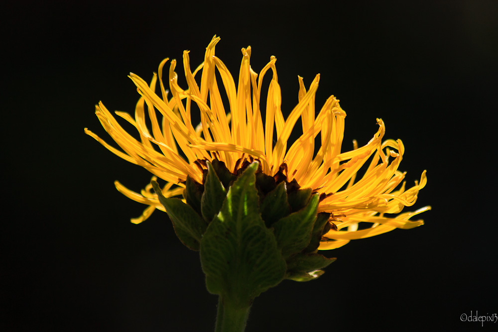
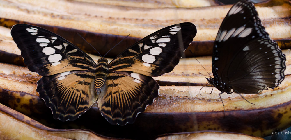
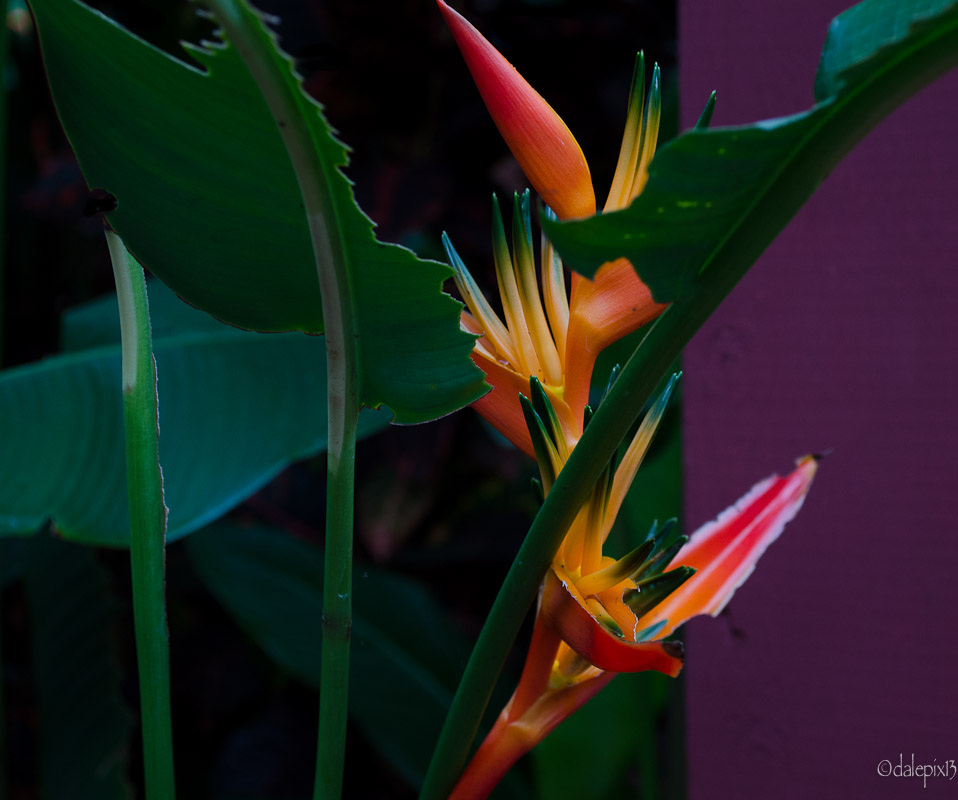
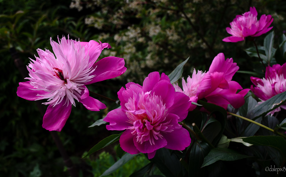
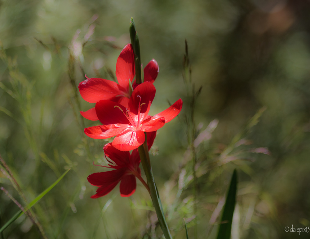
Took a few pics and attempted to seperate

the main subject from too much unwanted

background clutter.IMG_2510.jpgDSC_0603.jpgDSC_0776.jpgDSC_0855.jpgIMG_2386-4.jpg

sp_PlupAttachments Attachments
July 1, 2013
6:49 am
Avatar
Long Island, New York
Member
Members

VIP Student
Forum Posts: 2719
Member Since:
September 15, 2012
sp_UserOfflineSmall Offline

You did it again.  Beautiful!

-- Mandrake --

July 1, 2013
7:02 am
Avatar
Spartanburg, SC
Member
Members

VIP Student
Forum Posts: 1054
Member Since:
March 23, 2013
sp_UserOfflineSmall Offline

All of the pictures are great, but I really love the first one… the yellow against the black is really striking. 

July 1, 2013
9:04 am
Avatar
Member
Members
Forum Posts: 812
Member Since:
September 30, 2012
sp_UserOfflineSmall Offline

Beautiful shots, I like the 1st picture a lot, the color combination is really nice, yellow & black are best combination.

I don’t know some distraction on the right side of 1st butterfly.

Have you done any post production for the last shot, it feels as painting effect and its really nice.

Muneer

July 1, 2013
11:31 am
Avatar
Delft (Netherlands)
Member
Members
Forum Posts: 466
Member Since:
October 9, 2012
sp_UserOfflineSmall Offline

I like’em all as an Album!!
Nice shots…Dale.

Smile

July 2, 2013
7:42 am
Avatar
Member
Members

VIP Student
Forum Posts: 1594
Member Since:
December 2, 2012
sp_UserOfflineSmall Offline

Thanks guys for all those great comments.

Muneer – I did do post processing on the last shot

and actually reduced the clarity in Lightroom to give

a more blurred effect to the background appearance.

We usually want the sharpest image possible but sometimes

a “softer” image has a lot more impact than razor sharp!

Just like b&w can often blow you away with it’s dramatic effect

while a really colourful image is no big deal. Depends on the 

picture and the effect you’re trying to achieve.

I’m just having fun trying to get that “perfect” image that is like

winning the lottery lol!

Dale.

Forum Timezone: America/Los_Angeles

Most Users Ever Online: 239

Currently Online:
53 Guest(s)

Currently Browsing this Page:
1 Guest(s)

Top Posters:

Mandrake: 2719

nikonguy: 1594

mscharff: 1054

Muneer: 812

Silky: 554

intekhab0731: 553

sameerfulari: 466

Brian Copeland: 449

ergig: 307

Bjørn (Madman): 278

Member Stats:

Guest Posters: 7

Members: 2765

Moderators: 0

Admins: 1

Forum Stats:

Groups: 14

Forums: 87

Topics: 2908

Posts: 15556

Administrators: easyexposure: 2164

Comments are closed.