Colours... | Nature and Wildlife photos | Photo Forum

Welcome to a new Easy Exposure Photo Forum! I hope you will enjoy new features. It is still work in progress, so please be patients. Thanks!


Avatar

Please consider registering
guest

sp_LogInOut Log In sp_Registration Register sp_MemberList Members

Register | Lost password?
Advanced Search

— Forum Scope —


— Match —


— Forum Options —


Minimum search word length is 3 characters - maximum search word length is 84 characters

No permission to create posts
sp_Feed Topic RSS sp_TopicIcon
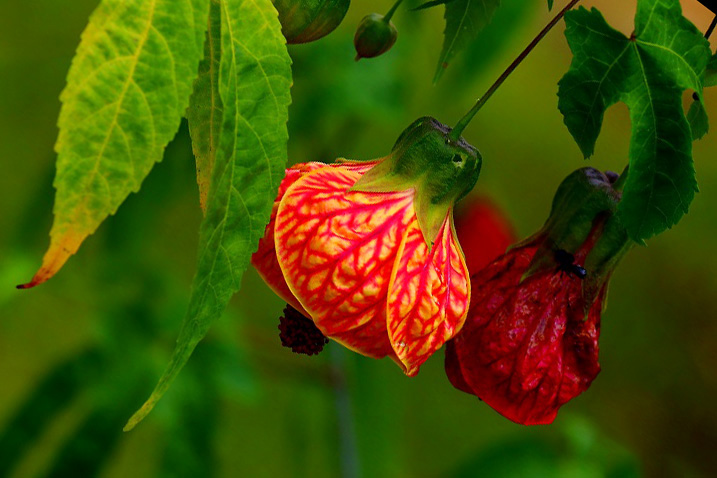
Colours...
January 20, 2014
3:48 pm
Avatar
Brazil
Member
Members

VIP Student
Forum Posts: 188
Member Since:
January 14, 2014
sp_UserOfflineSmall Offline

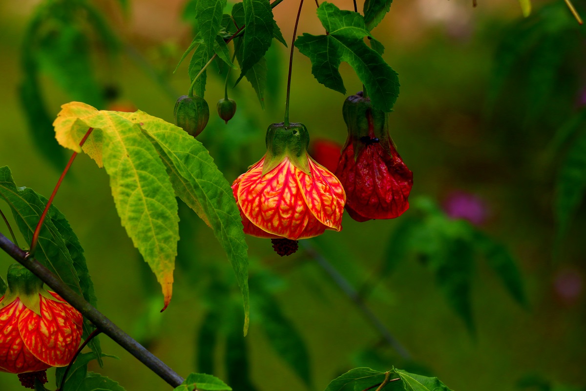
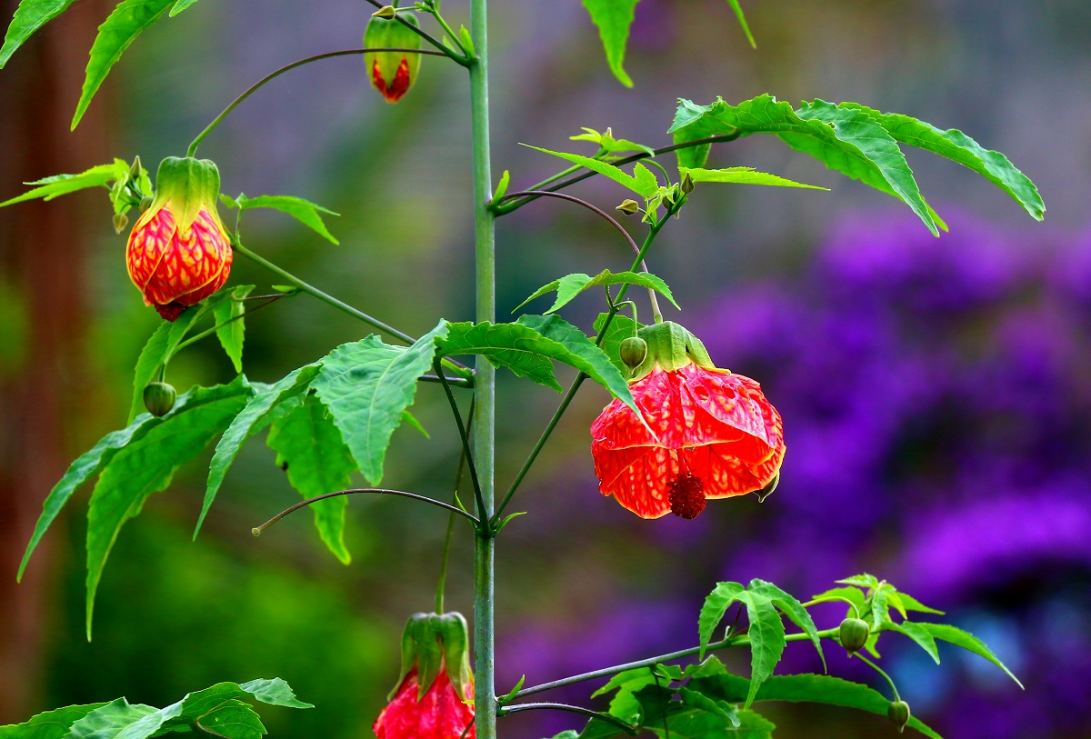
IMG_3320.jpgIMG_3322.jpg

sp_PlupAttachments Attachments
January 21, 2014
9:22 am
Avatar
Hamilton, Ontario, Canada
Member
Members

VIP Student
Forum Posts: 449
Member Since:
April 5, 2013
sp_UserOfflineSmall Offline

Love the vibrant colours.  What kind of plant/flower is that?


January 21, 2014
11:04 am
Avatar
Admin
Forum Posts: 2164
Member Since:
August 11, 2011
sp_UserOfflineSmall Offline

Beautiful colors and subject. But I think you need to work on composition on those. I feel like your eye doesn’t know there to go. Look at the first photo for example. Viewer is torn between the flowers in the middle and the flower on the edge. You could try to crop the flower on the edge off and place the flower in the middle in the rule of third. Let see if it will work better. 

January 21, 2014
11:28 am
Avatar
Brazil
Member
Members

VIP Student
Forum Posts: 188
Member Since:
January 14, 2014
sp_UserOfflineSmall Offline

easyexposure said
Beautiful colors and subject. But I think you need to work on composition on those. I feel like your eye doesn’t know there to go. Look at the first photo for example. Viewer is torn between the flowers in the middle and the flower on the edge. You could try to crop the flower on the edge off and place the flower in the middle in the rule of third. Let see if it will work better. 

You are so right, composition is for me the hardest, I am well aware of that, thanks for the good advice! I can use every bt of it :)


January 21, 2014
11:30 am
Avatar
Brazil
Member
Members

VIP Student
Forum Posts: 188
Member Since:
January 14, 2014
sp_UserOfflineSmall Offline

Brian Copeland said
Love the vibrant colours.  What kind of plant/flower is that?
 

Allthough it’s groing in my garden I must admit that I don’t know the name of this plant…


January 21, 2014
12:02 pm
Avatar
Long Island, New York
Member
Members

VIP Student
Forum Posts: 2719
Member Since:
September 15, 2012
sp_UserOfflineSmall Offline
Lanterna Chinesa ou Japonesa (Abutilon striatum) - Just a guess.


-- Mandrake --

January 21, 2014
1:28 pm
Avatar
Spartanburg, SC
Member
Members

VIP Student
Forum Posts: 1054
Member Since:
March 23, 2013
sp_UserOfflineSmall Offline

Mandrake is a man of many talents!  

January 22, 2014
2:59 am
Avatar
Brazil
Member
Members

VIP Student
Forum Posts: 188
Member Since:
January 14, 2014
sp_UserOfflineSmall Offline

mscharff said
Mandrake is a man of many talents!  

I think I second that…!


January 22, 2014
3:00 am
Avatar
Brazil
Member
Members

VIP Student
Forum Posts: 188
Member Since:
January 14, 2014
sp_UserOfflineSmall Offline

Mandrake said

Lanterna Chinesa ou Japonesa (Abutilon striatum) - Just a guess.


Thanks Ron! And by the way, I’ve seen some of your pictures… works of an artist! I’m really impressed!


January 22, 2014
4:13 am
Avatar
Brazil
Member
Members

VIP Student
Forum Posts: 188
Member Since:
January 14, 2014
sp_UserOfflineSmall Offline

easyexposure said
Beautiful colors and subject. But I think you need to work on composition on those. I feel like your eye doesn’t know there to go. Look at the first photo for example. Viewer is torn between the flowers in the middle and the flower on the edge. You could try to crop the flower on the edge off and place the flower in the middle in the rule of third. Let see if it will work better. 

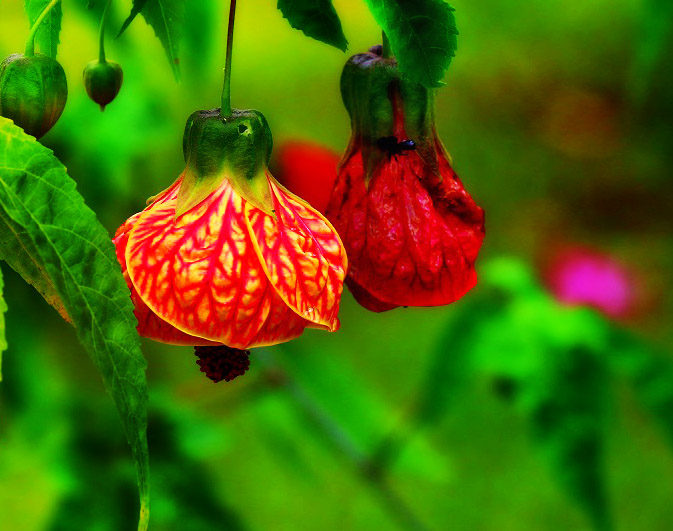
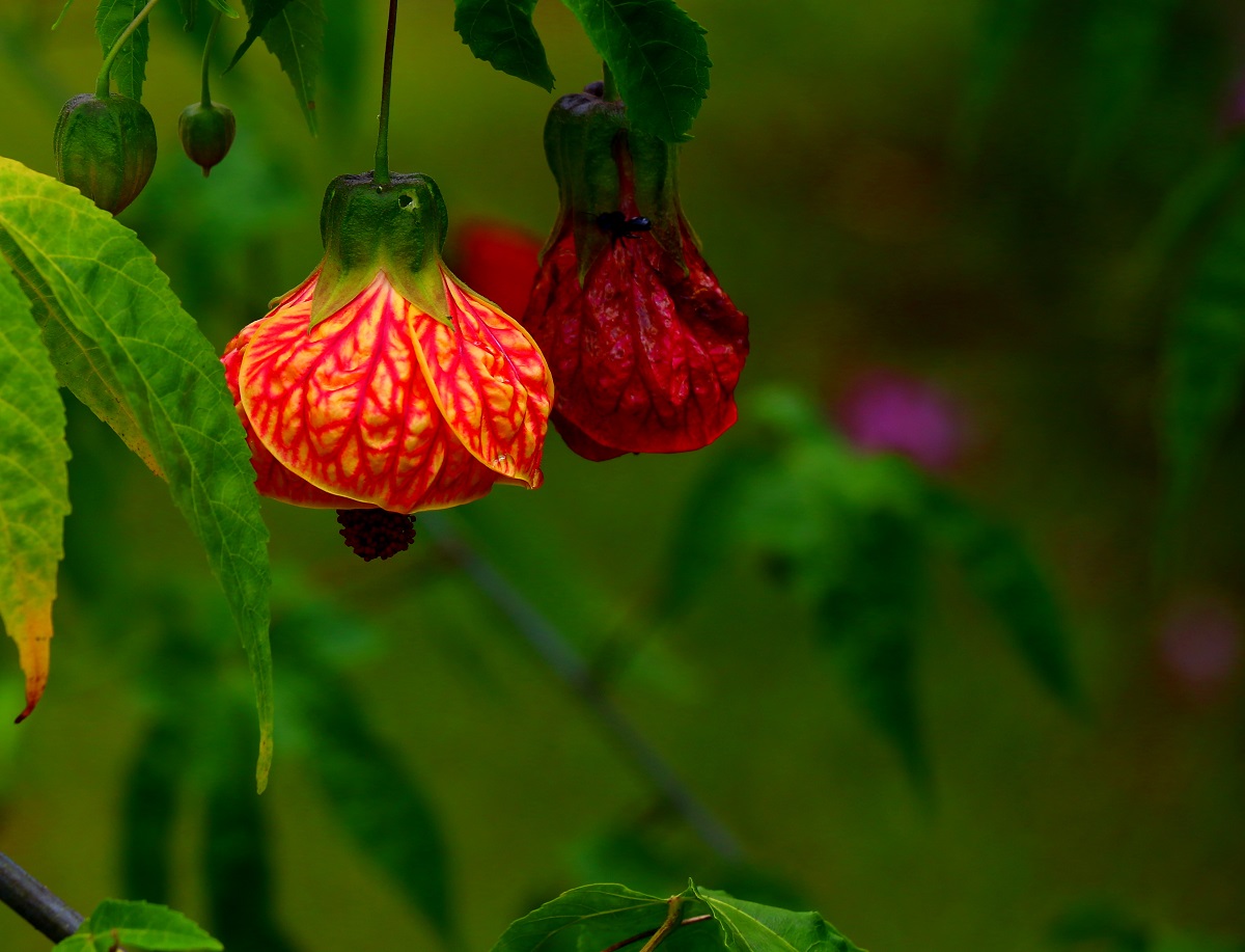
I still have the addiction to put everything in the center, but this time I tried to apply the rule of thirds. What do you think?
IMG_3320b.jpg


sp_PlupAttachments Attachments
January 22, 2014
5:33 am
Avatar
Spartanburg, SC
Member
Members

VIP Student
Forum Posts: 1054
Member Since:
March 23, 2013
sp_UserOfflineSmall Offline

I know the rule of thirds works both vertically and horizontally in pictures, but IMO, I’d probably crop off some of the bottom of this picture.

January 22, 2014
7:39 am
Avatar
Brazil
Member
Members

VIP Student
Forum Posts: 188
Member Since:
January 14, 2014
sp_UserOfflineSmall Offline

mscharff said
I know the rule of thirds works both vertically and horizontally in pictures, but IMO, I’d probably crop off some of the bottom of this picture.

Maybe just those peaces of leaves… could be interesting…


January 22, 2014
10:56 pm
Avatar
Admin
Forum Posts: 2164
Member Since:
August 11, 2011
sp_UserOfflineSmall Offline

I agree on those leaves at the bottom. They are a bit disturbing. I have an idea, Ronald. If you don’t mind, can others use you first photo and try to crop it? It will be interesting to see what everybody will come up with. 

January 23, 2014
2:46 am
Avatar
Brazil
Member
Members

VIP Student
Forum Posts: 188
Member Since:
January 14, 2014
sp_UserOfflineSmall Offline

easyexposure said
I agree on those leaves at the bottom. They are a bit disturbing. I have an idea, Ronald. If you don’t mind, can others use you first photo and try to crop it? It will be interesting to see what everybody will come up with. 

Great idea Oksana, that’s no problem at all!


January 23, 2014
4:27 am
Avatar
Spartanburg, SC
Member
Members

VIP Student
Forum Posts: 1054
Member Since:
March 23, 2013
sp_UserOfflineSmall Offline

one-option.jpgone option…

sp_PlupAttachments Attachments
January 23, 2014
4:52 am
Avatar
Long Island, New York
Member
Members

VIP Student
Forum Posts: 2719
Member Since:
September 15, 2012
sp_UserOfflineSmall Offline

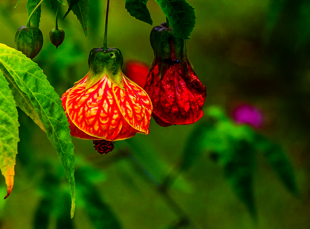
OK, here’s mine then.  I had done it yesterday, but didn’t want to post without permission.
Pretty much as yours, Michael, but I left all of the leaf in and brightened things up a bit.
bell-2.jpg

sp_PlupAttachments Attachments

-- Mandrake --

January 23, 2014
5:00 am
Avatar
Brazil
Member
Members

VIP Student
Forum Posts: 188
Member Since:
January 14, 2014
sp_UserOfflineSmall Offline

Hey guys, this is nice! I see that both of you brightened up the image a little which seames to work out nicely! It´s hard to choose between these two… but without doubt it got better with the leaves on the bottom cropped out. It´s great to learn from the more experienced people here, thanks!

January 23, 2014
8:54 am
Avatar
Admin
Forum Posts: 2164
Member Since:
August 11, 2011
sp_UserOfflineSmall Offline

This would be crop version:

my_crop-1.jpg

sp_PlupAttachments Attachments
January 23, 2014
9:27 am
Avatar
Brazil
Member
Members

VIP Student
Forum Posts: 188
Member Since:
January 14, 2014
sp_UserOfflineSmall Offline

That’s a totally different perspective, I never even thought about turning it around… Thanks for this eyeopener!

January 23, 2014
12:51 pm
Avatar
Long Island, New York
Member
Members

VIP Student
Forum Posts: 2719
Member Since:
September 15, 2012
sp_UserOfflineSmall Offline

easyexposure said
This would be crop version:

Yes, but Lanterna Chinesa always hang straight down as they should.

-- Mandrake --

No permission to create posts
Forum Timezone: America/Los_Angeles

Most Users Ever Online: 239

Currently Online:
23 Guest(s)

Currently Browsing this Page:
1 Guest(s)

Top Posters:

Mandrake: 2719

nikonguy: 1594

mscharff: 1054

Muneer: 812

Silky: 554

intekhab0731: 553

sameerfulari: 466

Brian Copeland: 449

ergig: 307

Bjørn (Madman): 278

Member Stats:

Guest Posters: 7

Members: 2765

Moderators: 0

Admins: 1

Forum Stats:

Groups: 14

Forums: 87

Topics: 2908

Posts: 15556

Administrators: easyexposure: 2164

Comments are closed.