Birds | Nature and Wildlife photos | Photo Forum

Welcome to a new Easy Exposure Photo Forum! I hope you will enjoy new features. It is still work in progress, so please be patients. Thanks!


Avatar

Please consider registering
guest

sp_LogInOut Log In sp_Registration Register sp_MemberList Members

Register | Lost password?
Advanced Search

— Forum Scope —


— Match —


— Forum Options —


Minimum search word length is 3 characters - maximum search word length is 84 characters

sp_Feed Topic RSS sp_TopicIcon
Birds
September 22, 2014
7:07 am
Avatar
Daytona Beach, Florida, USA
Member
Members
Forum Posts: 259
Member Since:
September 12, 2014
sp_UserOfflineSmall Offline

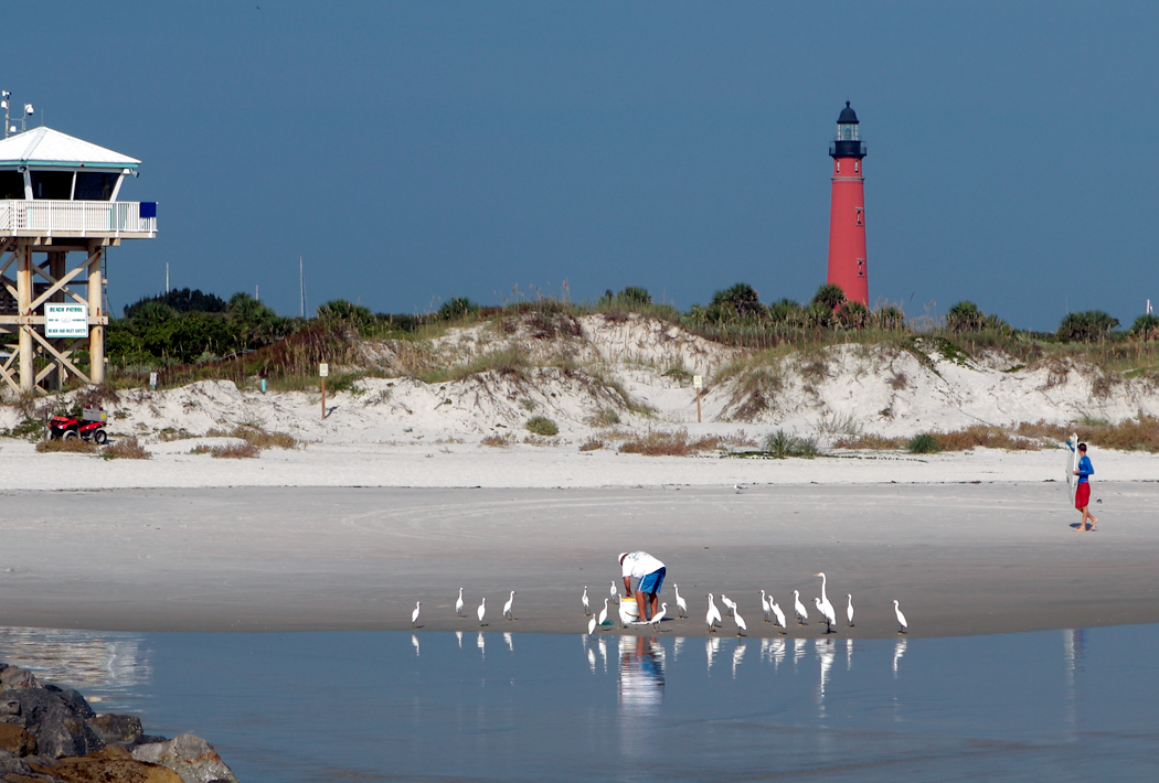
The man was catching bait fish in his net. This happens to me same place, all the time too.IMG_1179.jpg

sp_PlupAttachments Attachments
December 9, 2014
1:07 pm
Avatar
Admin
Forum Posts: 2164
Member Since:
August 11, 2011
sp_UserOfflineSmall Offline

Nice photo with the story. The only thing what bothers me is the cut off tower on the left. I would easer cut it off and make a photo square or include more of it. 

December 10, 2014
4:33 am
Avatar
Daytona Beach, Florida, USA
Member
Members
Forum Posts: 259
Member Since:
September 12, 2014
sp_UserOfflineSmall Offline

Yes, I know Oksana, but if you can imagine in your mind visually, if i cloned it out, it would be alot of bare space and not balance the lighthouse. If i make it a square photo, it’s not as appealing as a rectangular one is.

The only way to make it look good (better) would be to ADD some of the left side of photo to the right side to extend that…putting the lighthouse more towards a good balance in central region.

Of course I could have done that when i took the photo, but I’m not real critical usually unless it’s a GREAT shot of something. I’m fishing, and I just ballpark these kind quickly.

December 31, 2014
7:18 pm
Avatar
Admin
Forum Posts: 2164
Member Since:
August 11, 2011
sp_UserOfflineSmall Offline

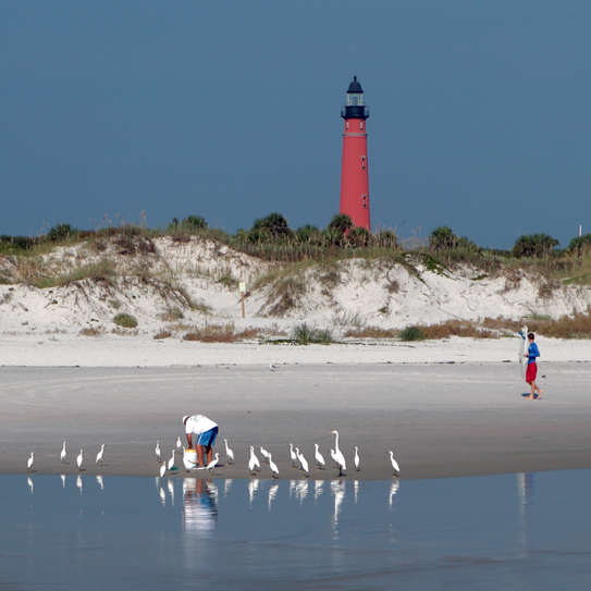
I like it as square. Less distraction elements. I might spend to much time on instagram, lol image.png

sp_PlupAttachments Attachments
January 3, 2015
12:15 pm
Avatar
Long Island, New York
Member
Members

VIP Student
Forum Posts: 2719
Member Since:
September 15, 2012
sp_UserOfflineSmall Offline

Agree.  I’d also edit out the boy, white pole and sign.

-- Mandrake --

January 4, 2015
12:25 pm
Avatar
Admin
Forum Posts: 2164
Member Since:
August 11, 2011
sp_UserOfflineSmall Offline

I actually don’t mind the boy. It creates a triangle and makes your eyes wander between the three. Pole and sign can go. 

January 5, 2015
9:04 am
Avatar
Daytona Beach, Florida, USA
Member
Members
Forum Posts: 259
Member Since:
September 12, 2014
sp_UserOfflineSmall Offline

I did edit all that was said and improved the brightness some too. Anyone ever use Etsy? Where you can TRY………and sell paintings or photos? I tried a little about a year ago with a painting or two, but no luck. I’m trying again…but it’s hard to figure it out..prices, shipping costs etc

January 5, 2015
11:40 am
Avatar
Admin
Forum Posts: 2164
Member Since:
August 11, 2011
sp_UserOfflineSmall Offline

I think of the sited like Etsy, putting just a few products would not work. Etsy shop is a business and you need to know what it takes to make it successful. Where are tons of articles about running Etsy business (just google). Here is one of them:
http://www.dailydot.com/busine…..s-success/

Forum Timezone: America/Los_Angeles

Most Users Ever Online: 239

Currently Online:
60 Guest(s)

Currently Browsing this Page:
1 Guest(s)

Top Posters:

Mandrake: 2719

nikonguy: 1594

mscharff: 1054

Muneer: 812

Silky: 554

intekhab0731: 553

sameerfulari: 466

Brian Copeland: 449

ergig: 307

Bjørn (Madman): 278

Member Stats:

Guest Posters: 7

Members: 2771

Moderators: 0

Admins: 1

Forum Stats:

Groups: 14

Forums: 87

Topics: 2919

Posts: 15567

Administrators: easyexposure: 2164

Comments are closed.