Welcome to a new Easy Exposure Photo Forum! I hope you will enjoy new features. It is still work in progress, so please be patients. Thanks!
 Topic RSS


 (0 votes)
 8:27 pm
January 9, 2013
 Offline
12:25 am
VIP Student
September 15, 2012
 Offline
12:42 am
January 9, 2013
 Offline
11:30 am
VIP Student
September 15, 2012
 Offline
I’m sorry, Eric. I didn’t quite understand what you needed.
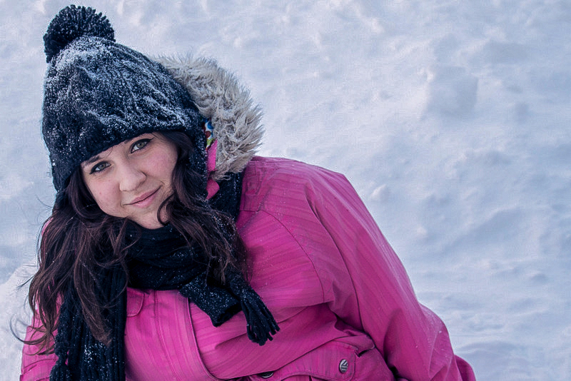
This is what I was able to do with Lightroom and Photo Shop Elements.
Most cameras also have a “snow” setting that will adjust the white balance and lower the exposure.
You might want to try that and see if it is effective.
Mandrake

-- Mandrake --
12:16 pm
January 9, 2013
 Offline
6:55 am
August 5, 2012
 Offline
Shooting snow is like shooting on white backdrop, since it doesn’t have any details in it, there is now reason to bring attention to it the main subject is the person unless ofcoarse its a landscape shot. To make the background more interesting try changing the angle to include some other things surrounding you, like building or some trees (evergreen trees usually give nice green colors that look great with snow), adding blue sky with clouds also might work. Shooting at golden hour might be a thing to consider.
Good luck!
Mandrake I am sorry but I think it is unethical to edit someones picture, when they ask for advice on how to take better photos in snow. I think if you want to show an example, show one of your images. Unless you show exactly how you did it there is now way to learn how to do it. Its better to try to explain how to do it and have a person figure it out on their own.
Again I am sorry I didn’t mean to offend you. I am a no body here. I just felt like speaking my mind.
10:58 am
January 9, 2013
 Offline
11:06 am
January 9, 2013
 Offline
3:44 pm
VIP Student
December 2, 2012
 Offline
Something I was told, and use when taking pics with a high degree of contrast is to
set exposure etc. for the brightest part of the scene and do adjustments in post processing.
If you follow this, the highlights (eg snow) won’t be blown out and you can bring back the shadow
areas in Lightroom or Photoshop.
Just a suggestion that works for me. It’s all practice and the reward of a good shot is worth it.
Dale
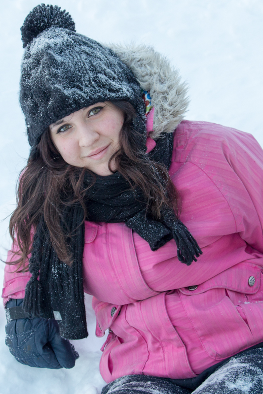
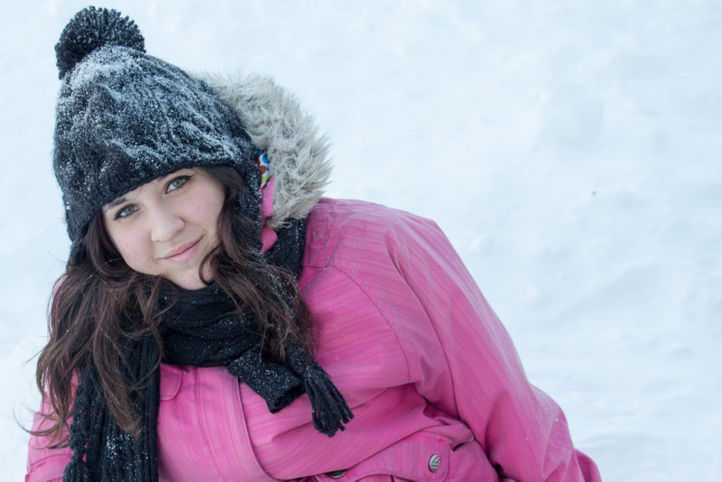
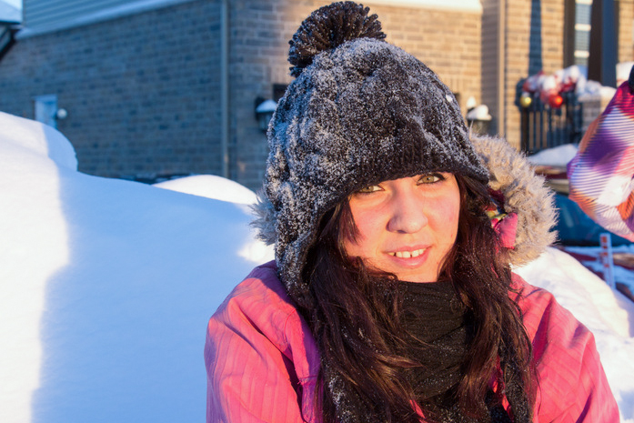
The first photo is much better, but I think you should have played with angles and composition a bit more in the first photo. There is nothing wrong with a plain background, often it is even better, if you feel it with the subject right. The empty space on the right doesn’t feels right to me and her pose kind of takes you out of the photo instead of in. Maybe try playing with a crop tool. On the second photo background is way to busy. Also pay attention that you don’t include other people’s body parts in your portraits. They usually distracting too.
10:17 am
January 9, 2013
 Offline
Quote from nikonguy on January 11, 2013, 15:44
Something I was told, and use when taking pics with a high degree of contrast is to
set exposure etc. for the brightest part of the scene and do adjustments in post processing.
Thanks, i’ll definitely give this a try today when the sun’s out or during sunset.
10:17 am
January 9, 2013
 Offline
Quote from easyexposure on January 12, 2013, 01:20
The first photo is much better, but I think you should have played with angles and composition a bit more in the first photo. There is nothing wrong with a plain background, often it is even better, if you feel it with the subject right. The empty space on the right doesn’t feels right to me and her pose kind of takes you out of the photo instead of in. Maybe try playing with a crop tool. On the second photo background is way to busy. Also pay attention that you don’t include other people’s body parts in your portraits. They usually distracting too.
Thanks for the good tips Oksana, i’ll try cropping it even more. there was actually the same amount of empty space the other side.. felt cropping even more i’d see only her face..
What does busy background mean? Too many different objects visible in the background or should have blurred it using a bigger aperture?
I’ll play around more and resend them.
Thanks again.

4:35 pm
VIP Student
December 2, 2012
 Offline
You are right when you interpret Oksana’s statement that picture #2 is too busy.
If you could imagine your daughter on the left third of the photo and the snow to
the right with no distractions from unnecessary background “clutter” you would have
a lovely picture that has your daughter as the main theme which is what you were
attempting to accomplish. Great pics of your little girl and a lot more enjoyable with her
and no distractions.
I’m sure you can see that the last cropped image is so much better than the image with
her on the left side and way too much space on the right.
Hope that long explanation helps you. The actual images of your daughter only are very nice.
Dale
Most Users Ever Online: 1107
Currently Online:
25 Guest(s)
Currently Browsing this Page:
1 Guest(s)
Top Posters:
Mandrake: 2719
nikonguy: 1594
mscharff: 1054
Muneer: 812
Silky: 554
intekhab0731: 553
sameerfulari: 466
Brian Copeland: 449
ergig: 307
Bjørn (Madman): 278
Member Stats:
Guest Posters: 9
Members: 2557
Moderators: 0
Admins: 1
Forum Stats:
Groups: 14
Forums: 87
Topics: 2764
Posts: 15326
Newest Members:
Rollinsparry, maryamsmarthasAdministrators: easyexposure: 2164
 Log In
 Members
 Home
Home


