Welcome to a new Easy Exposure Photo Forum! I hope you will enjoy new features. It is still work in progress, so please be patients. Thanks!
 Topic RSS


 (0 votes)
 9:57 pm
January 28, 2013
 Offline
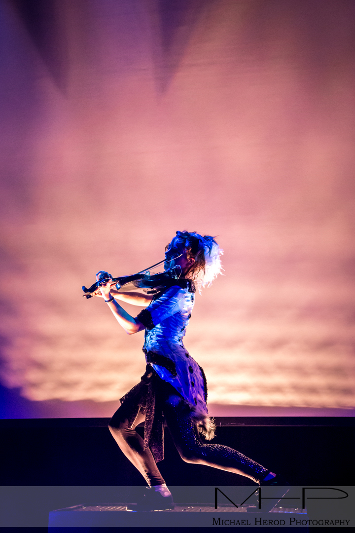
I was lucky enough to secure a contract to photograph this artist while she was on tour.
This venue had no photographer pit so I was jammed elbow to elbow with the fans at a sold out show which was actually a great experience since I was right there in the thick of things despite the involved difficulties of not being able to move around. They only let you shoot the first 3 songs, which is common practice with most bands and venues.
Concerts are fantastic to shoot, you can throw a lot of the rules out the window and just have fun shooting, you pretty much have to shoot in manual mode though, the camera just isn’t smart enough to get the right exposure in such dynamic lighting and then of course you can’t get creative exposures. Anyways, here are a couple of the photos.
I was really nervous after submitting the images to her assistant since they regularly work with professional photographers, I can’t describe how relieving and how exciting it was to hear that they loved the photos.

10:23 pm
October 9, 2012
 Offline
4:25 am
VIP Student
September 15, 2012
 Offline
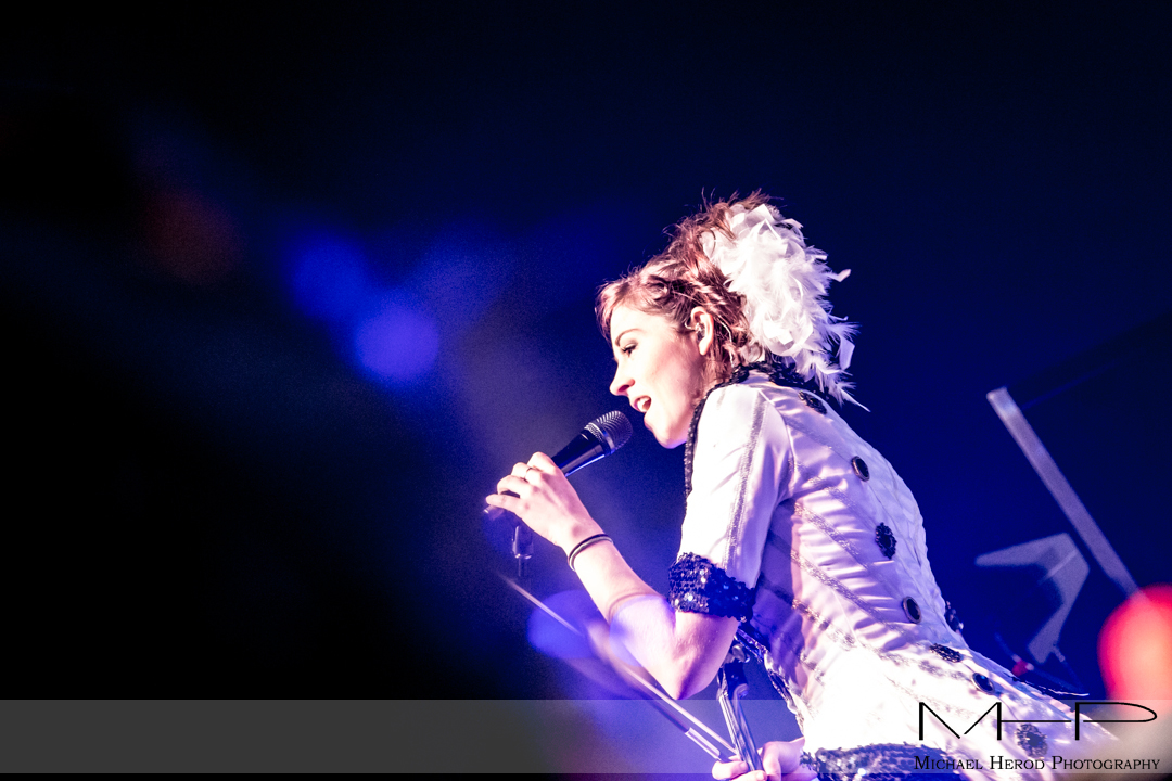
I think the third is the best of her,
although the logo appears to make it a promotional photo for the photographer.
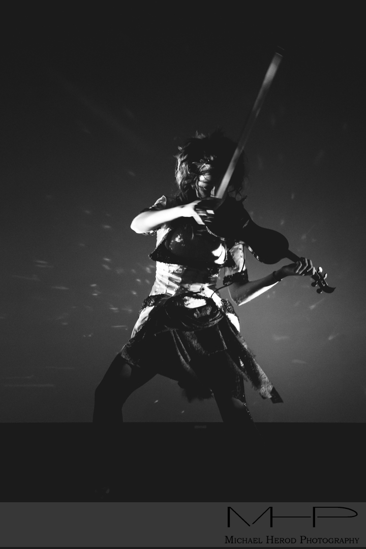
The lighting and angle of the first shot, unfortunately, distort her features.
The shadows above her eyebrows are particularly unattractive.
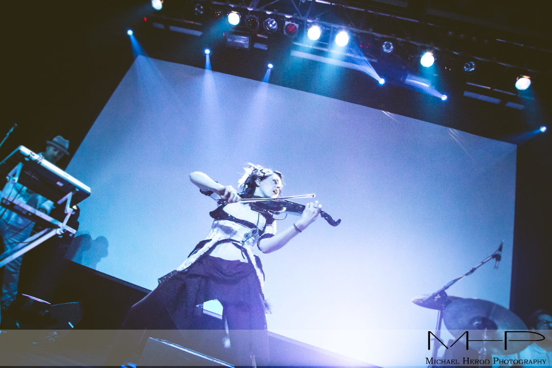
I do like the fourth shot as she is looking down and making a connection with
the audience, which we know is in the dark, empty space.
Great angles and lighting on this one.
-- Mandrake --
8:26 am
VIP Student
December 2, 2012
 Offline
MHP Mike said
Thanks guys, it was a ton of fun.
Mandrake, they were provided with high resolution logo free images. My logo is placed on the images to protect my business interest anywhere else
There is nothing wrong with placing logo on the images which are going online, especially the ones you are proud of. You want people to know who took them in case they want to hire you. I actually like how you put your logo on the images with transparent background.
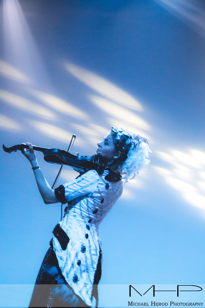
My favorites are 2 and 4. They are totally opposite from each other.
# 2 is mysterious and powerful at the same time. I like that you can barely see her face behind the violin. Her pose is strong. You also captured movement in one hand. Light is also interesting.
On # 4, on other hand, she looks soft and open. You can see her face very well. Interesting angle.
I agree with Mandrake about # 1. The light doesn’t look flattering on her. Other then that, I could be a great shoot. This is one of the challenge during shooting concerts, you can’t control the light.
Most Users Ever Online: 1107
Currently Online:
25 Guest(s)
Currently Browsing this Page:
1 Guest(s)
Top Posters:
Mandrake: 2719
nikonguy: 1594
mscharff: 1054
Muneer: 812
Silky: 554
intekhab0731: 553
sameerfulari: 466
Brian Copeland: 449
ergig: 307
Bjørn (Madman): 278
Member Stats:
Guest Posters: 9
Members: 2557
Moderators: 0
Admins: 1
Forum Stats:
Groups: 14
Forums: 87
Topics: 2764
Posts: 15326
Newest Members:
Rollinsparry, maryamsmarthasAdministrators: easyexposure: 2164
 Log In
 Members
 Home
Home


